 Mohamed Gamal
Purple Camel
Case study — a creative venture: brand, system, output, product. Art direction and design: Mohamed Gamal.
Agencies sell hours. Purple Camel sells outcomes.
THE PROBLEM.
01 · Why agency production breaks
Agency production breaks at volume: quality depends on whoever executes.
Every new hand is a new interpretation of the brand. Purple Camel treats production as a designed system.
THE BRAND.
02 · The venture, named and positioned
One author end to end — name, identity, social, system, product — for Saudi e-commerce brands, in their language first.
Human art direction. AI-accelerated production.
Product in. Campaign out.
-
Market
Saudi e-commerce brands — Arabic first, English second.
-
Personality
Confident, systematic, direct — rules written down and kept.
-
Known for
One visual language per client, held at production volume.
THE IDENTITY.
03 · The final system, not the tries
-
Recognizable
Ownable at a glance — legible even cropped or reversed.
-
Scalable
One geometry from favicon to hero plate; reproduces in one colour.
-
Bilingual
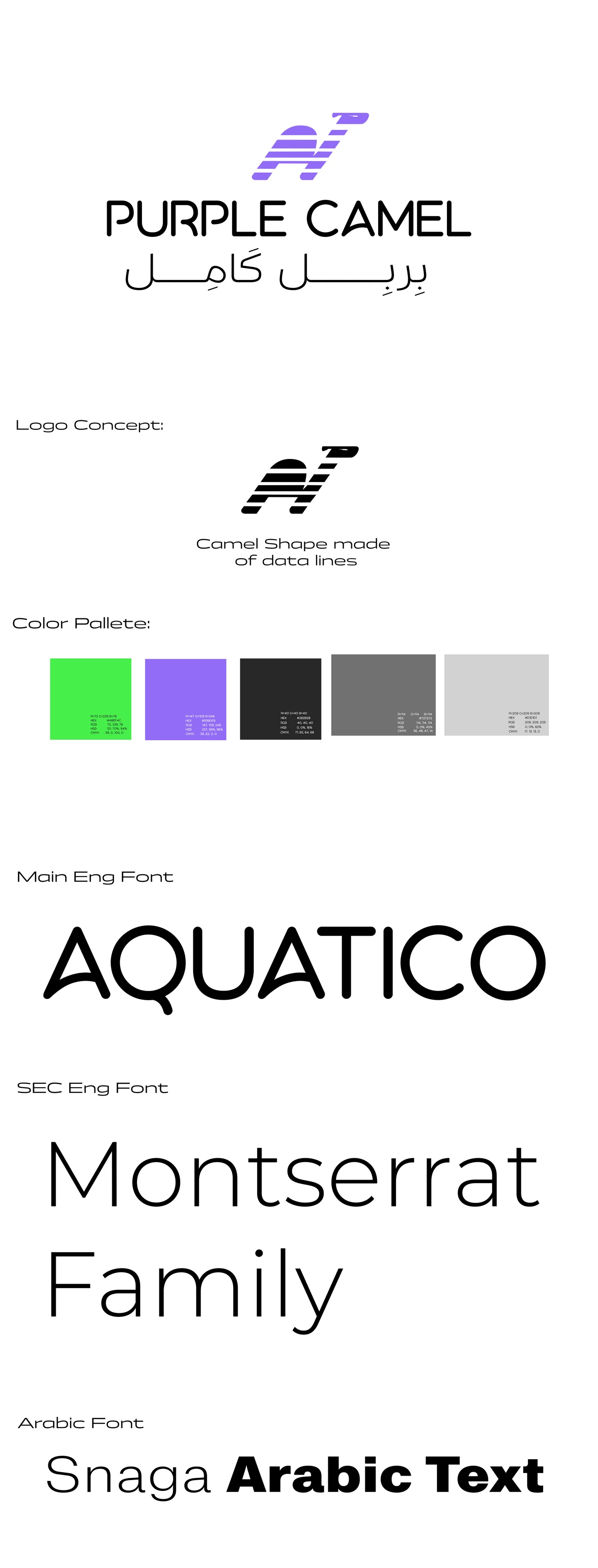
بربل كامِل beside PURPLE CAMEL — Arabic is the identity, not an afterthought.
-
Digital-first
Violet-only product surfaces; a hotter social voice in lime.
Canvas
#ECECEC
Surface
#FFFFFF
Text
#0A0A0A
Violet
#7C3AED
Social lime
#39FF6A
-
Display
Archivo Black — uppercase, tight.
-
Text · UI
Inter, with a Space Mono label layer.
-
Arabic
Cairo Black display · IBM Plex Sans Arabic body.


One mark, three duties.
[ Identity v1 ]
The shipped system kept the mark, the violet, the bilingual rule.
The don’t list is the identity: no second accent, no shadows, no cartoon camel.
IN THE REAL WORLD.
04 · The social voice, shipped
The brand behaved in public first: opinion-led arguments in the hot register.
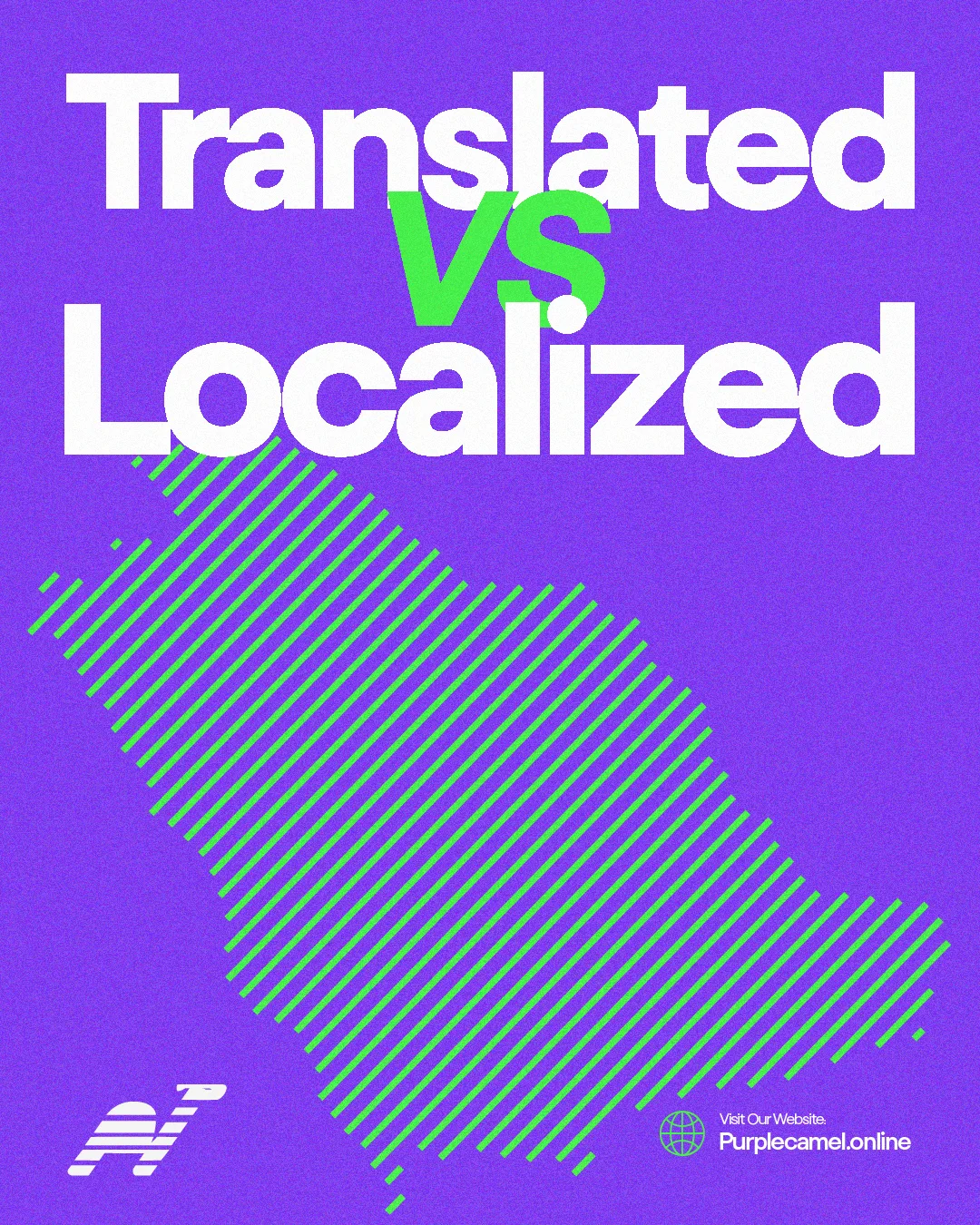
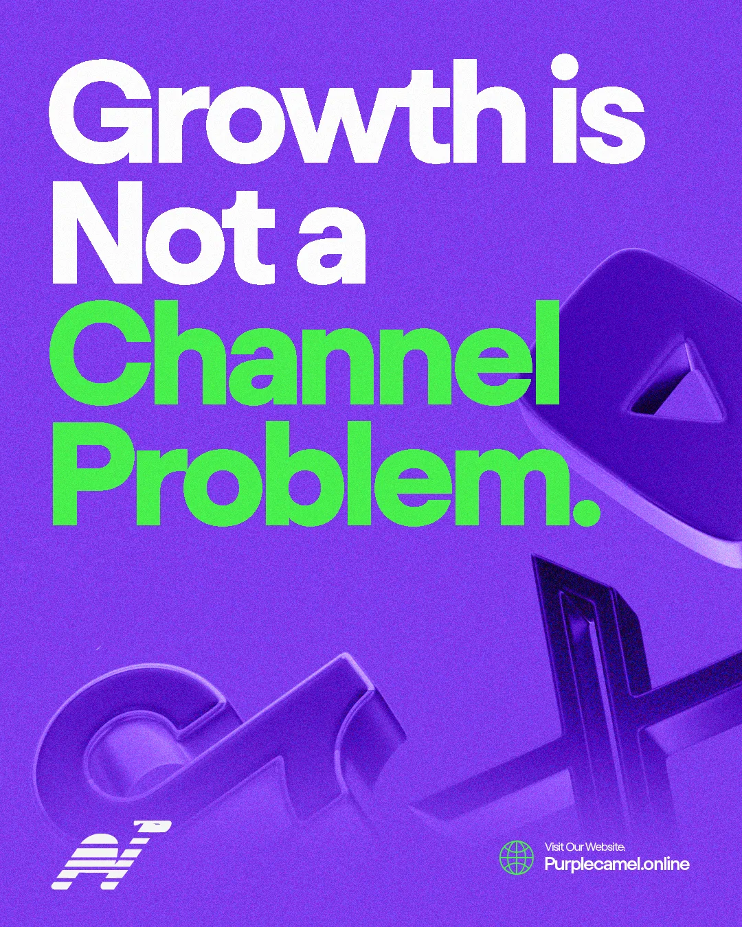
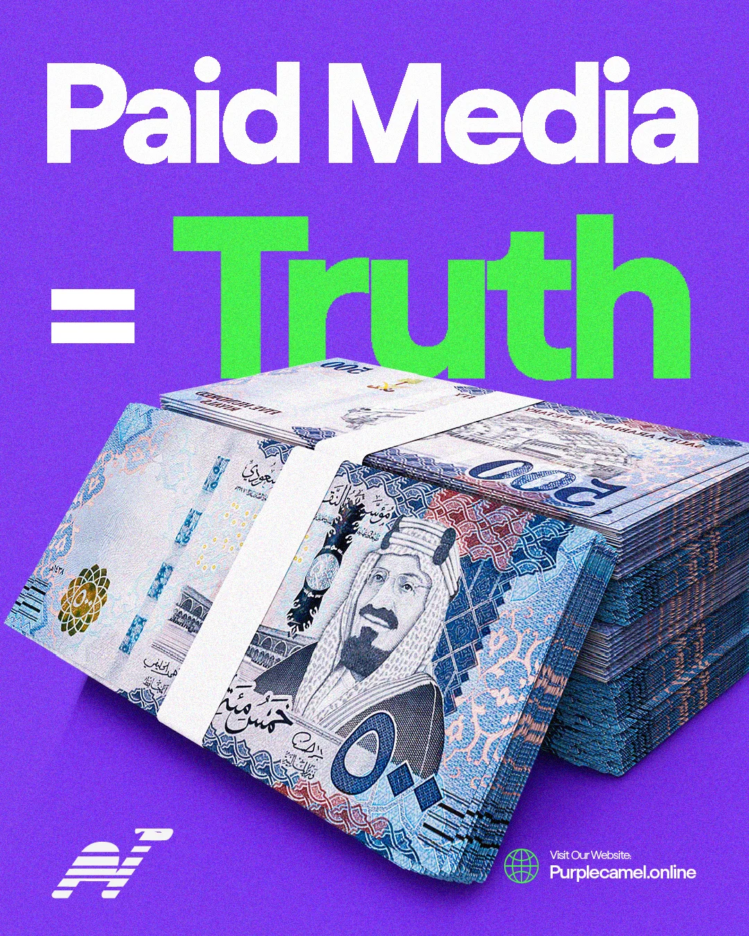
An argument per post; the palette does the recognition.
THE CREATIVE SYSTEM.
05 · How consistency is held
The brand is run by a system, not by memory.
Five layers govern every engagement.
(01)
Positioning
who it’s for, what it replaces
(02)
Identity
how it looks, sounds, holds standards
(03)
Experience
where belief becomes purchase
(04)
Growth
how it acquires and retains
(05)
Operating
how it stays consistent at scale
CREATIVE OUTPUT.
06 · What the practice produced
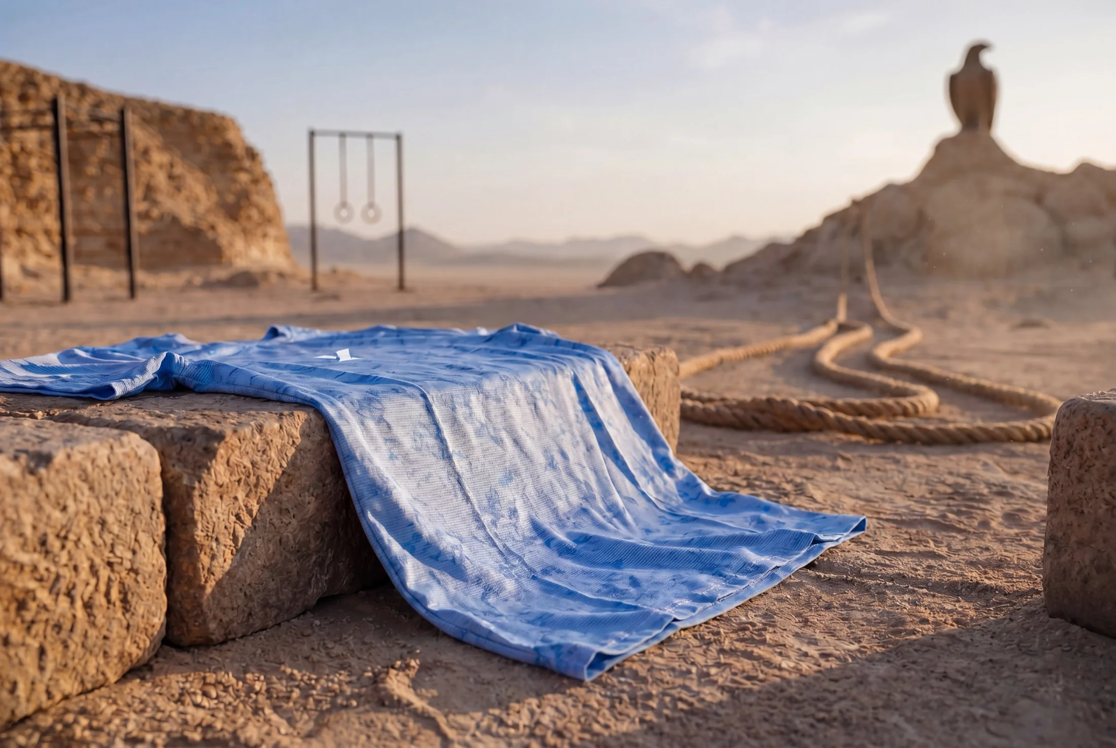
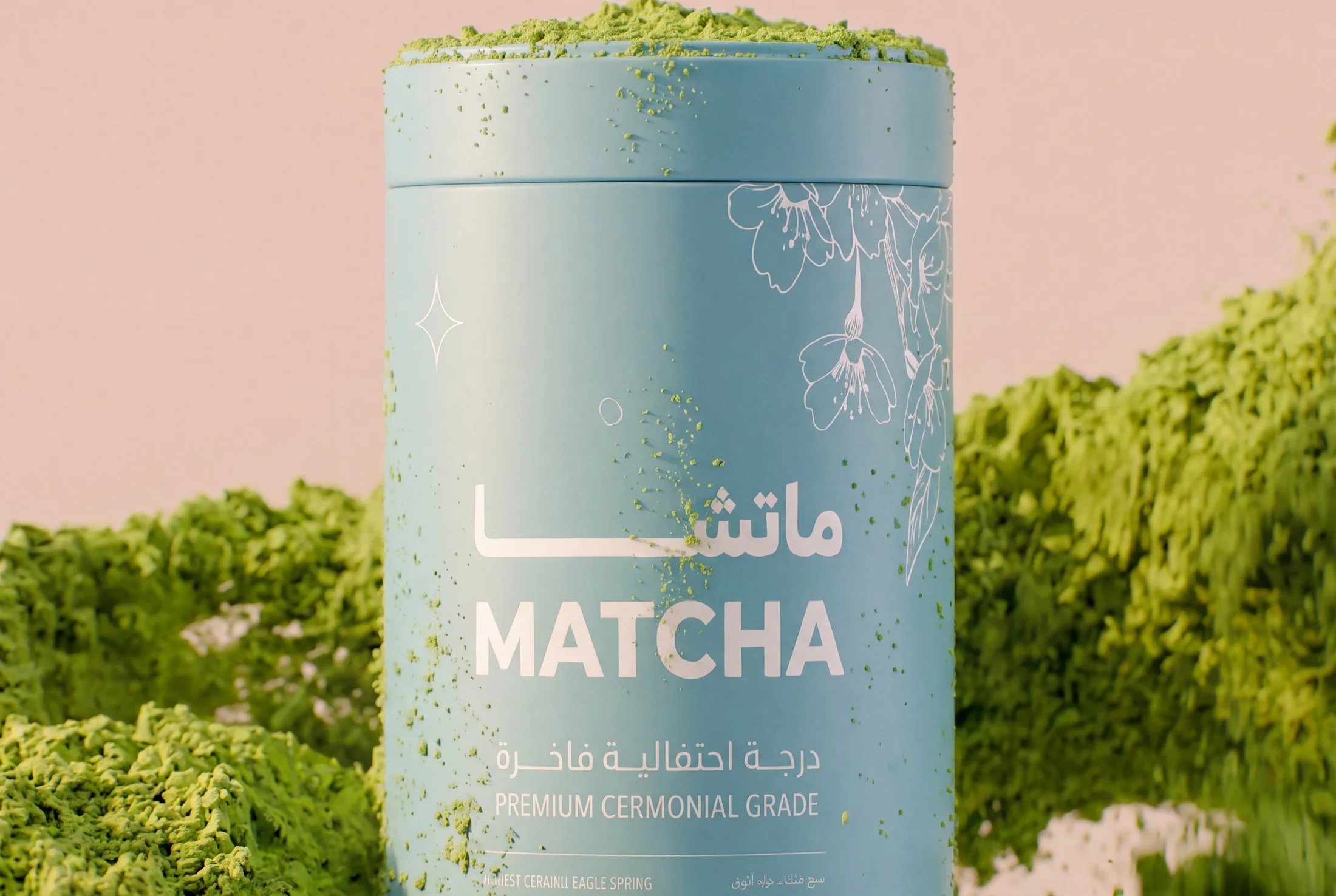
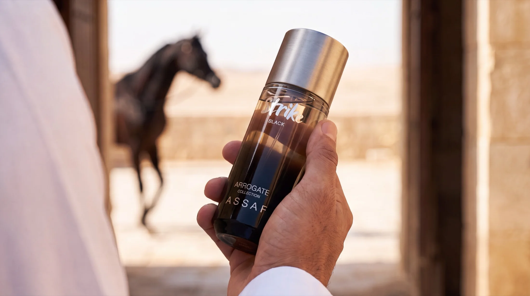
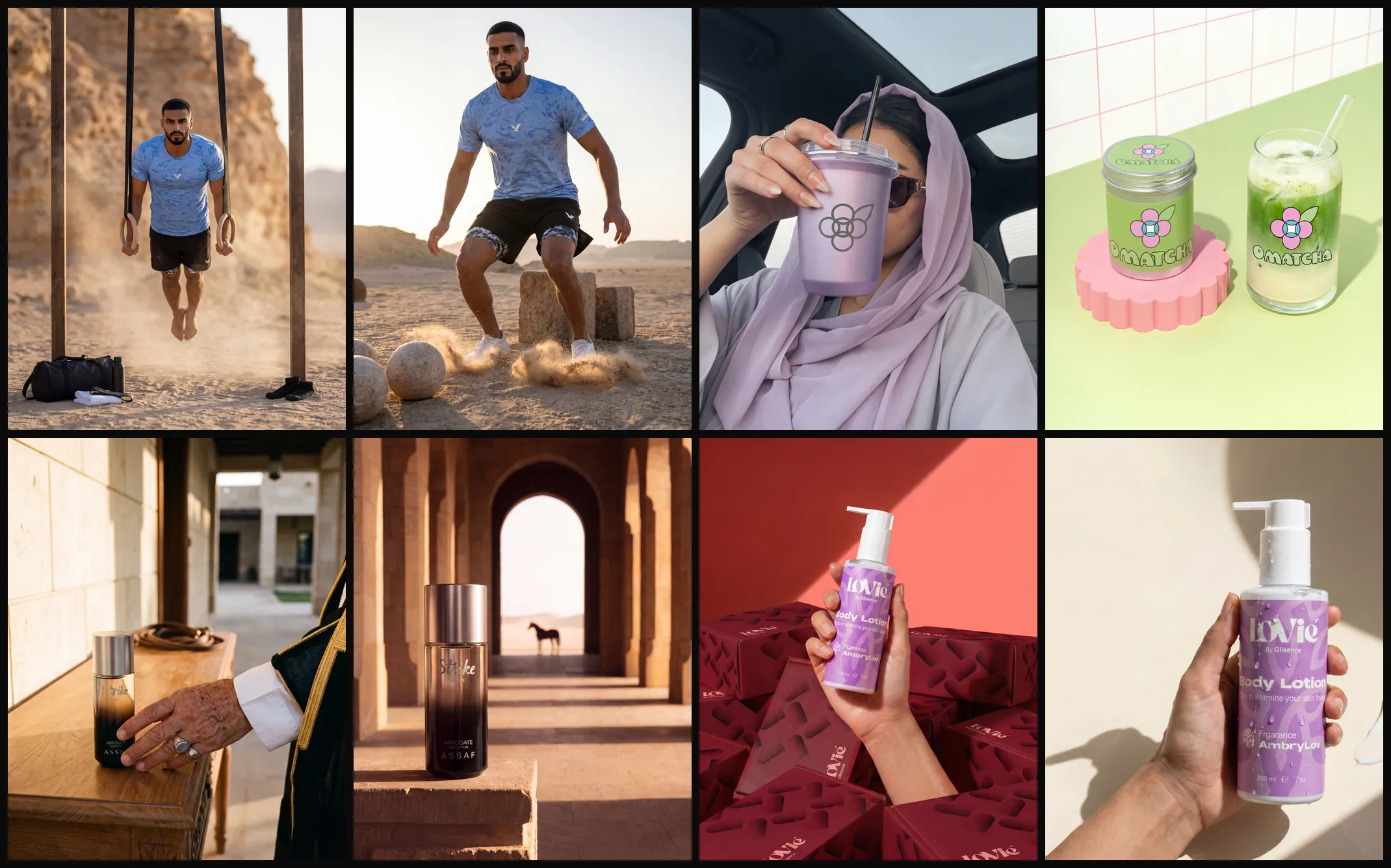
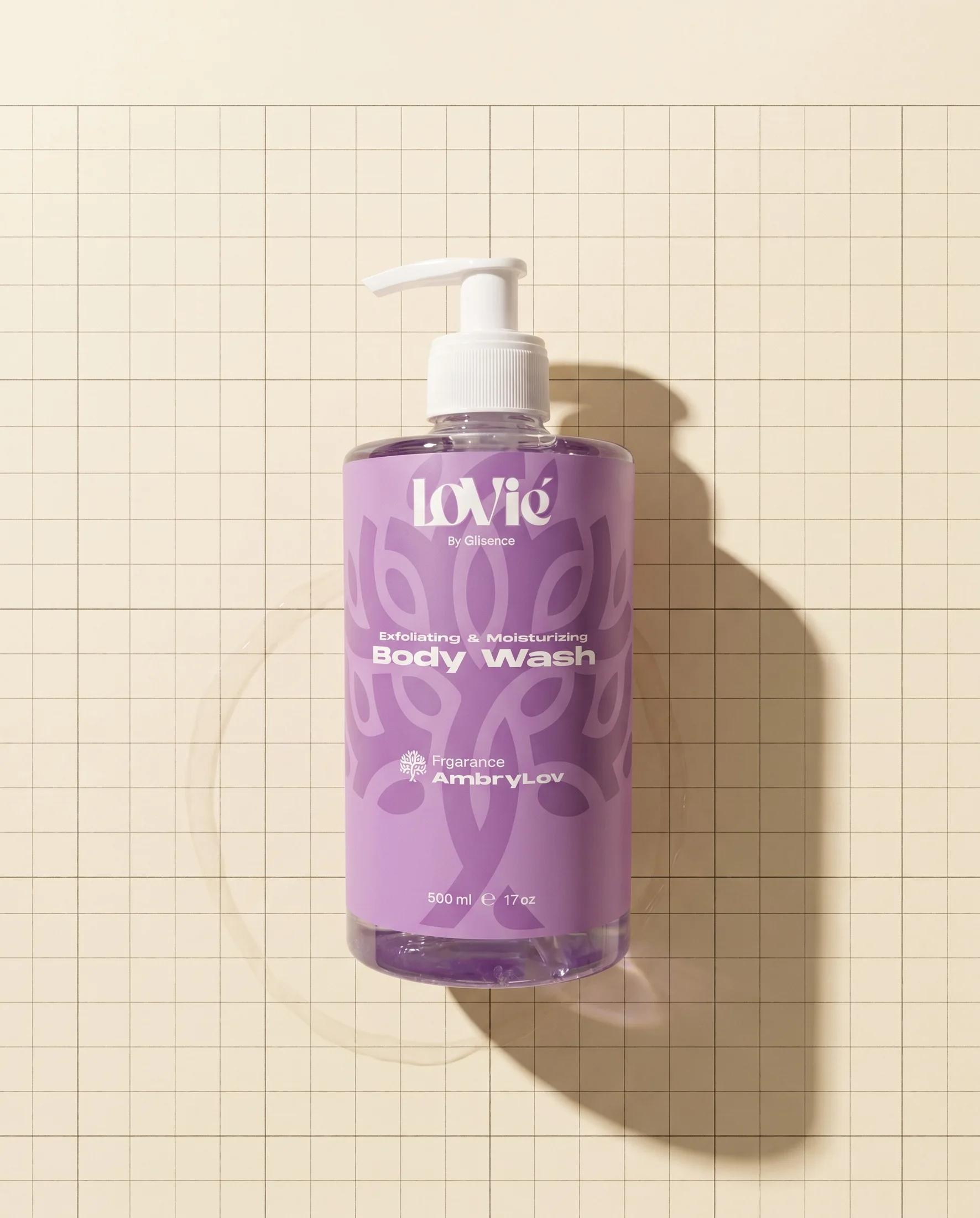
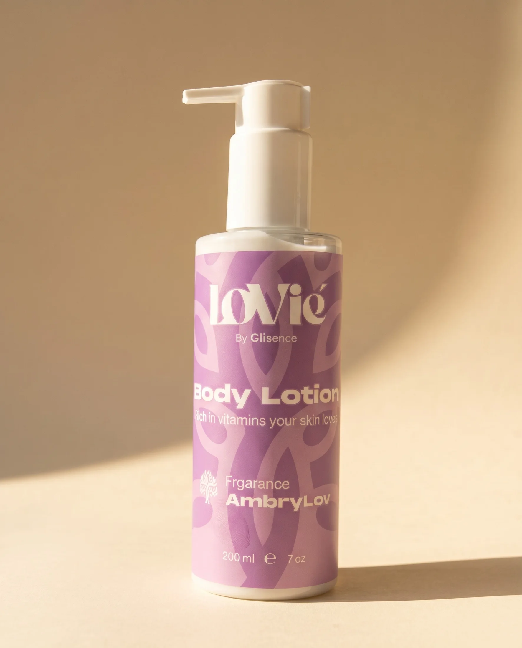
Brand worlds, none leaking into another: OQAB’s desert cannot drift into OMatcha’s pastel.

-
Client worlds
OQAB · OMatcha · ASSAF.
-
Own brand
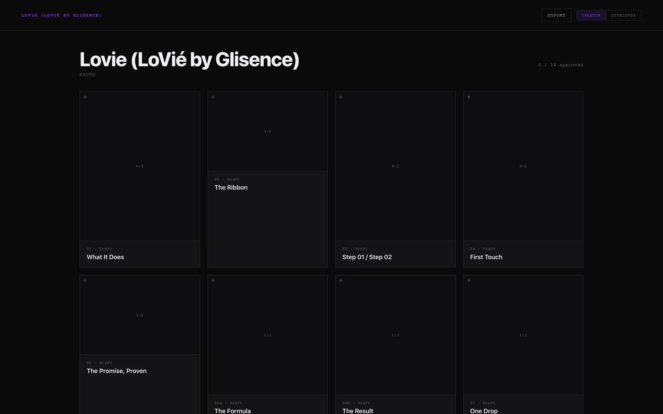
Lovie — the founder’s own brand.
-
Client campaigns
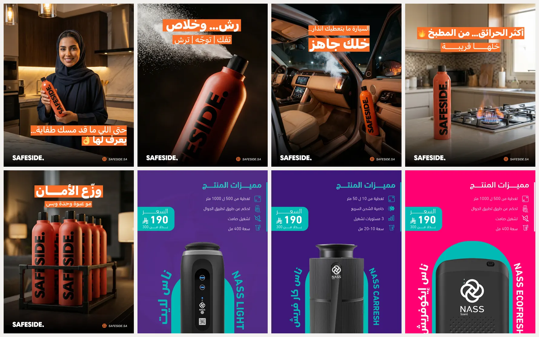
Safeside · Nass — below.
07 · The hinge
The system worked. The next problem was scale.
The ceiling was human hours — and hiring hands is how agencies drift. Production had to become a product.
CREATIVE LAB.
08 · An internal SaaS product, built in-house

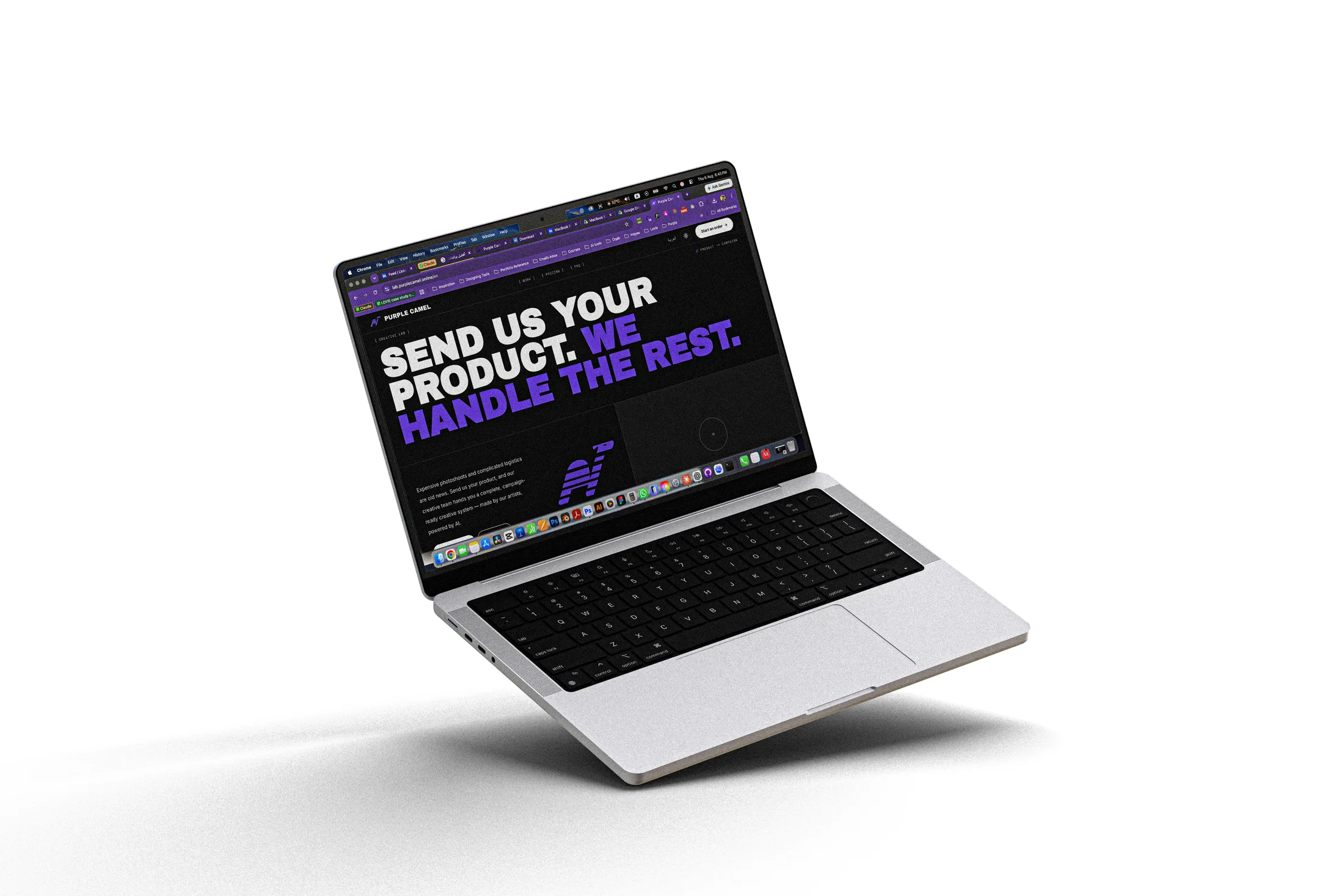
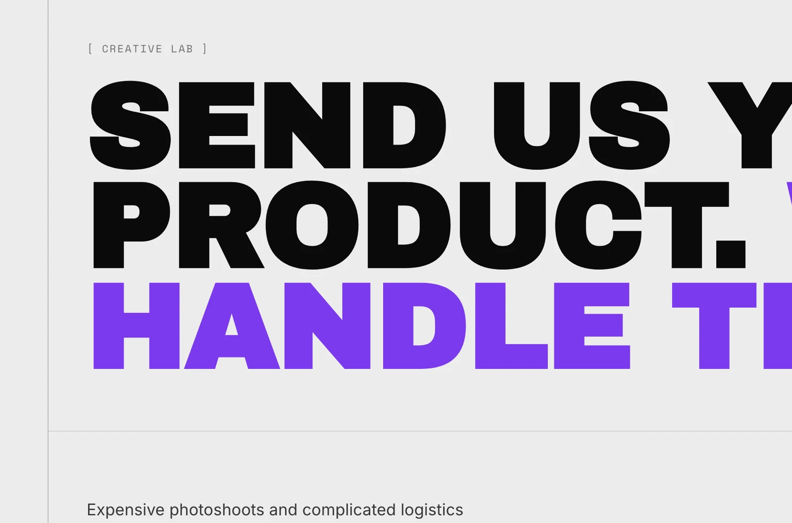
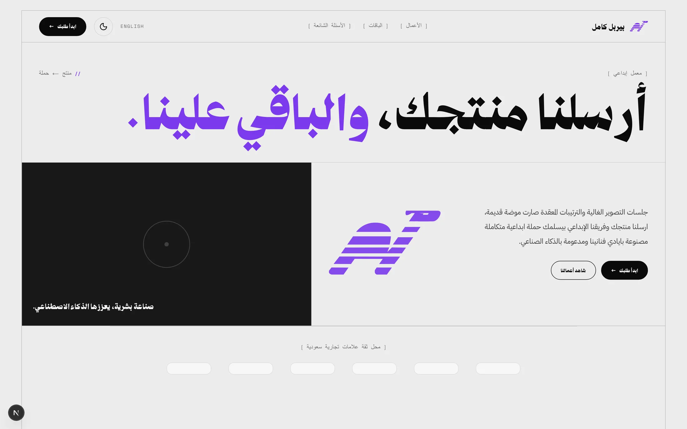
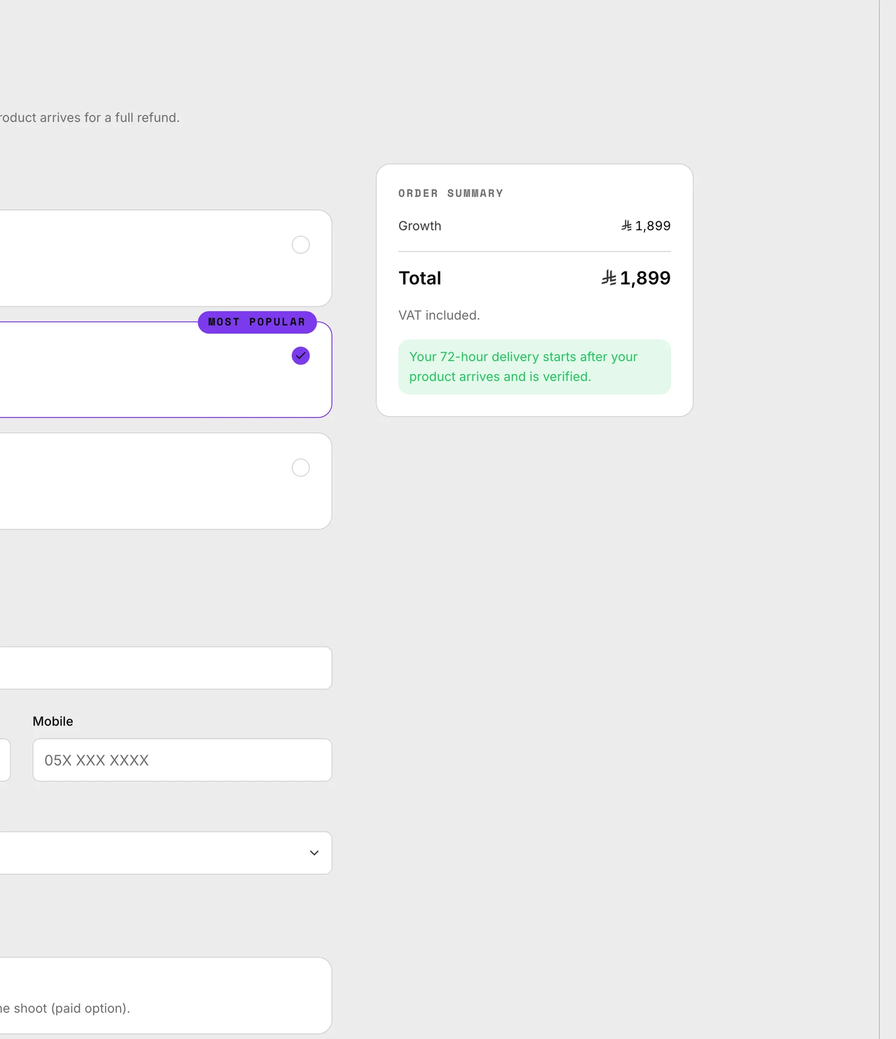
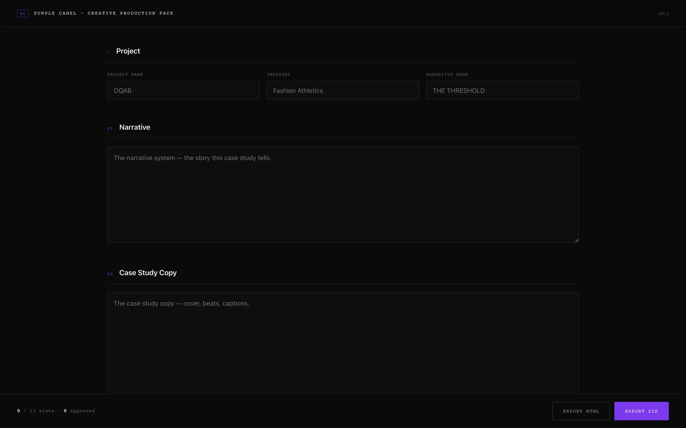
Not a tool adopted — a product designed and built: a bilingual platform running production as a service.
01
Order
Three packages — 999 / 1899 / 2999 SAR. Mada, Apple Pay, Visa.
02
Art direction
A human sets concept, lighting, direction.
03
Production
Led by artists, accelerated by the system.
04
Delivery
A complete creative system, within 72 hours.

THE WORKFLOW.
09 · AI inside a designed process
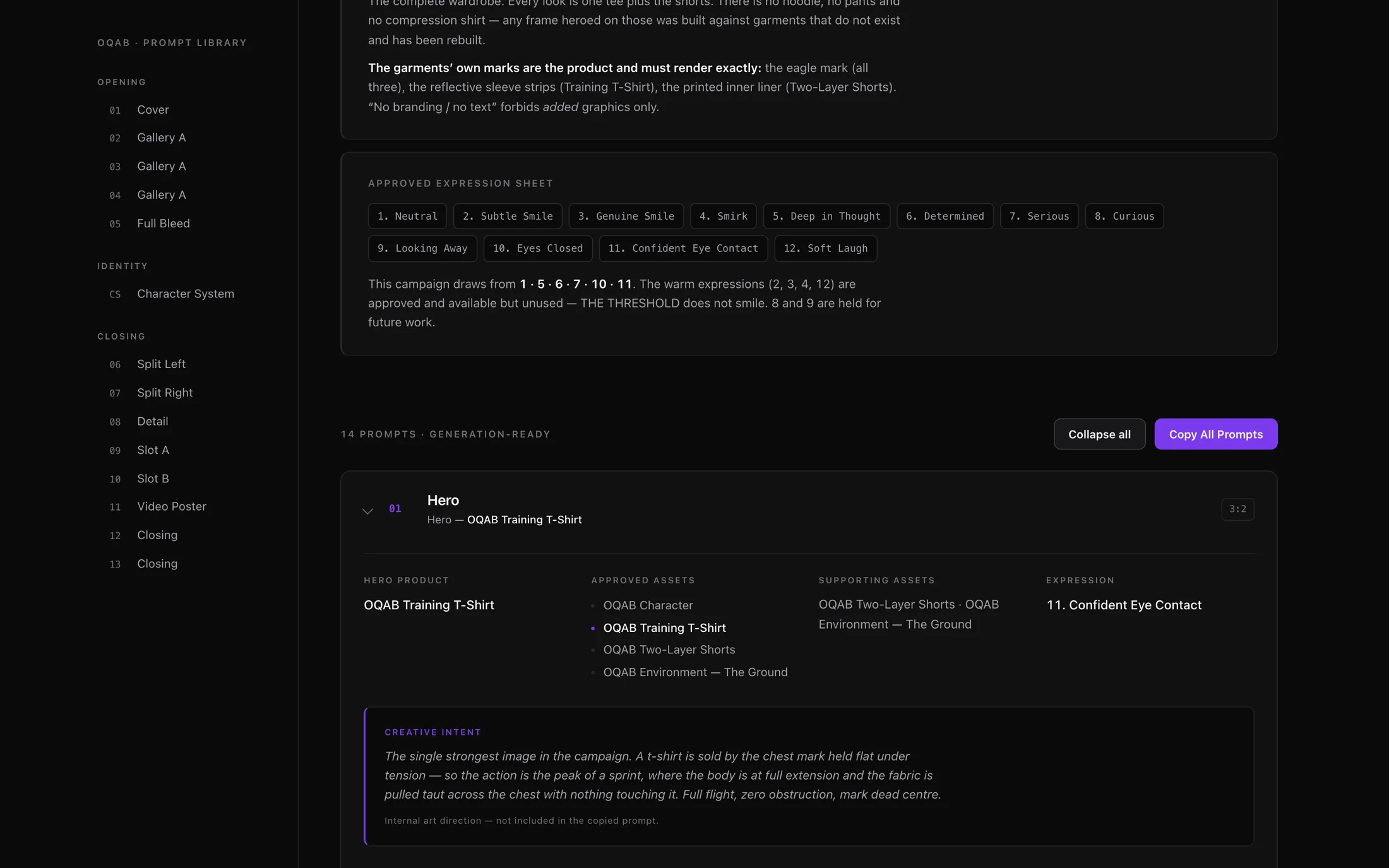
Consistency is engineered, never generated.
Direction written before generation runs; output curated against the brand world.
01
Brief
02
Creative direction
03
Generation
04
Curation
05
QC
06
Final creative
“Taste is not automatable, and the pipeline’s final gate is human by design.”
THE RESULT.
10 · Operational outcomes — nothing invented
-
Repeatable
Tested, not asserted: the same console, pointed at a second brand’s dataset, rendered that world with zero code changes.
-
Consistent
Four worlds, one language each, held at volume.
-
Shipped
A bilingual product with real payments, running the service end to end.
One connected practice.
A brand. A system. A product. Built by one person, working as one thing.
[ Everything built ]
-
The brand
Name, positioning, market — the venture itself.
-
The identity
The data-line camel, bilingual lockups, the rules.
-
The social voice
The brand behaving in public.
-
The creative system
Five layers — consistency by design.
-
The output
OQAB, OMatcha, ASSAF, Lovie, Safeside, Nass.
-
The product
Creative Lab — an internal SaaS product with real payments.
-
The documentation
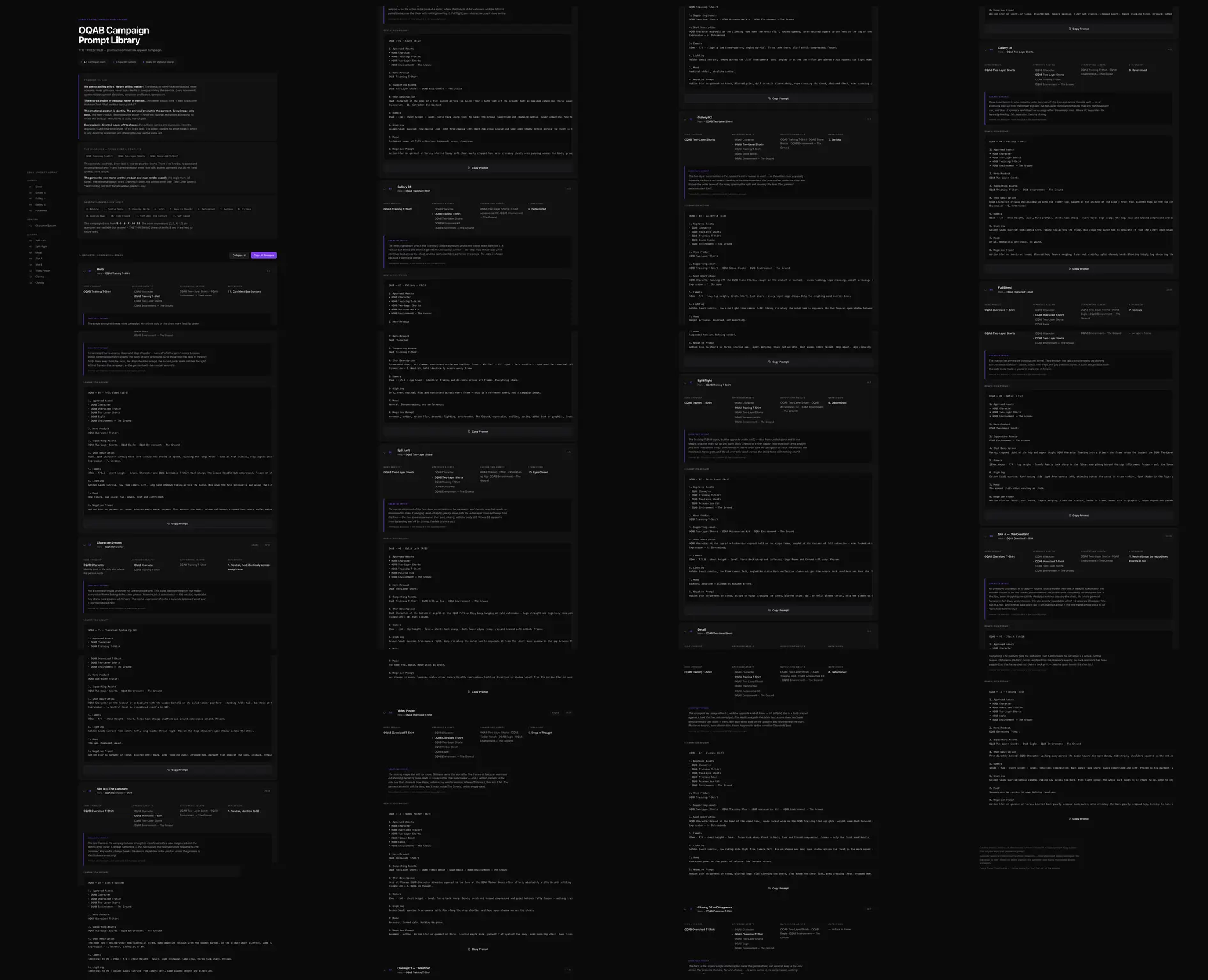
Spec, research, playbook, production packs.
Art direction, identity and build: Mohamed Gamal. The software is one deliverable. The practice is the work.