 Mohamed Gamal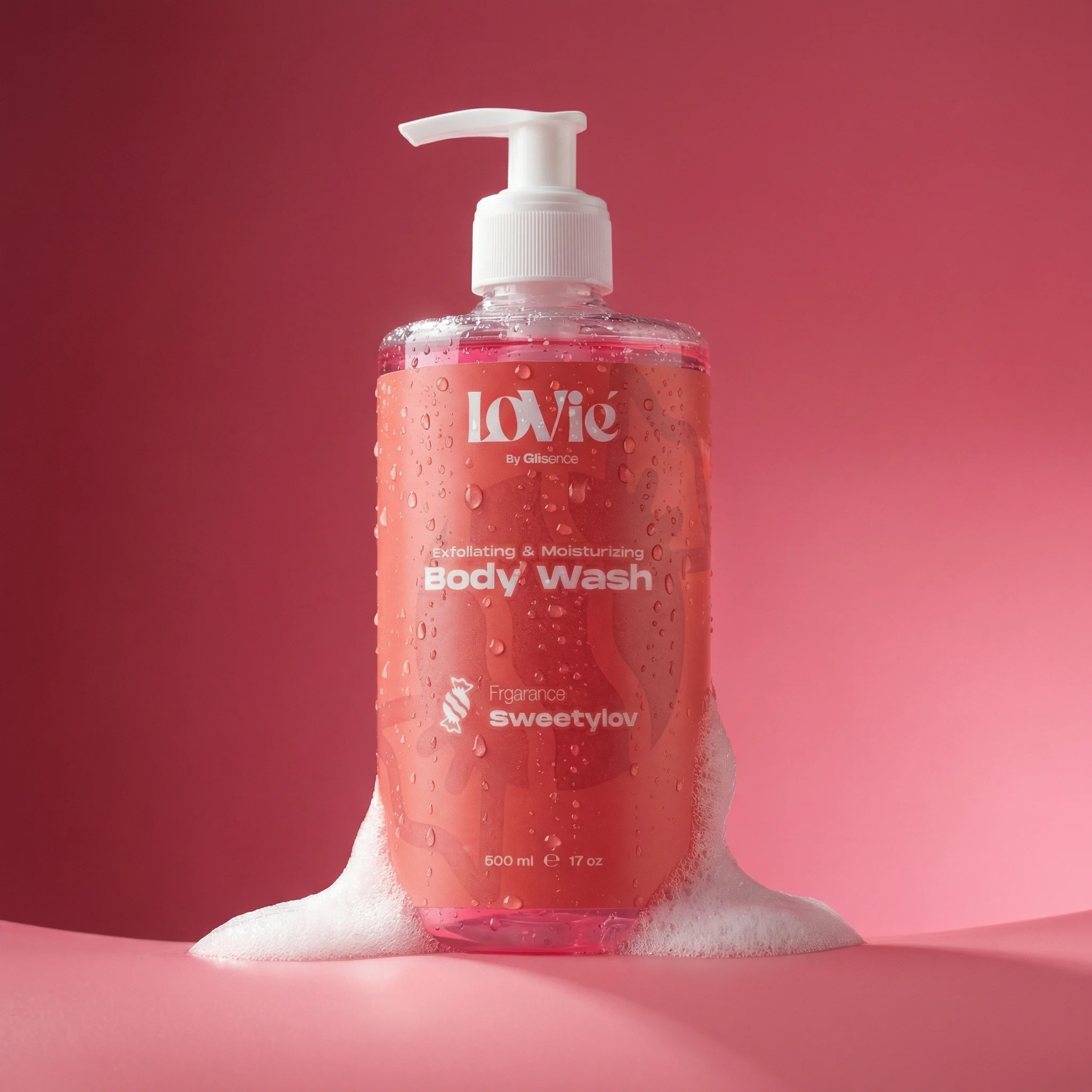
LOVIE Case study —Senior brand design & art direction: the visualworld of a premium skincare brand, concept to market.
Dr. Samar owns the science and the business. Everything you see is my design.
THE PROBLEM.
01 · The gap in the market
The gap was commercial: prestige-grade craft with a real skin-science story, made locally, priced in pounds.
Fragrance is emotional; skincare is rational. Lovie holds both — scent like perfume, claims like dermatology.
The imports
Bath & Body Works · Victoria’s Secret
Hard currency, art-directed for someone else.
The opening
LOVIE
Accessible premium in pounds. Nobody local invests in art direction at this rung.
The locals
The accessible tier
Price and availability — no craft, no identity.
THE STRATEGY.
02 · Decisions before design
-
The customer
Egyptian, 16–35: discovers on TikTok, buys on her phone, gifts heavily.
-
The behaviour
Scent drives repurchase; proof justifies the price.
01
Wash
Cleanse and exfoliate — AHA.
02
Lotion
Seal and hydrate — ceramides.
03
Perfume
Scent that lasts the day.
The second and third product ride the first purchase.
[ Three worlds, not three products ]
Every future product drops into an existing world — scale without fragmenting.
-

AmbryLov
Violet
The woody-amber world — confident, sensual.
-

Lovilla
Orange
The soft floral world — warm, approachable.
-

Sweetylov
Red
The candy world — bold, playful.
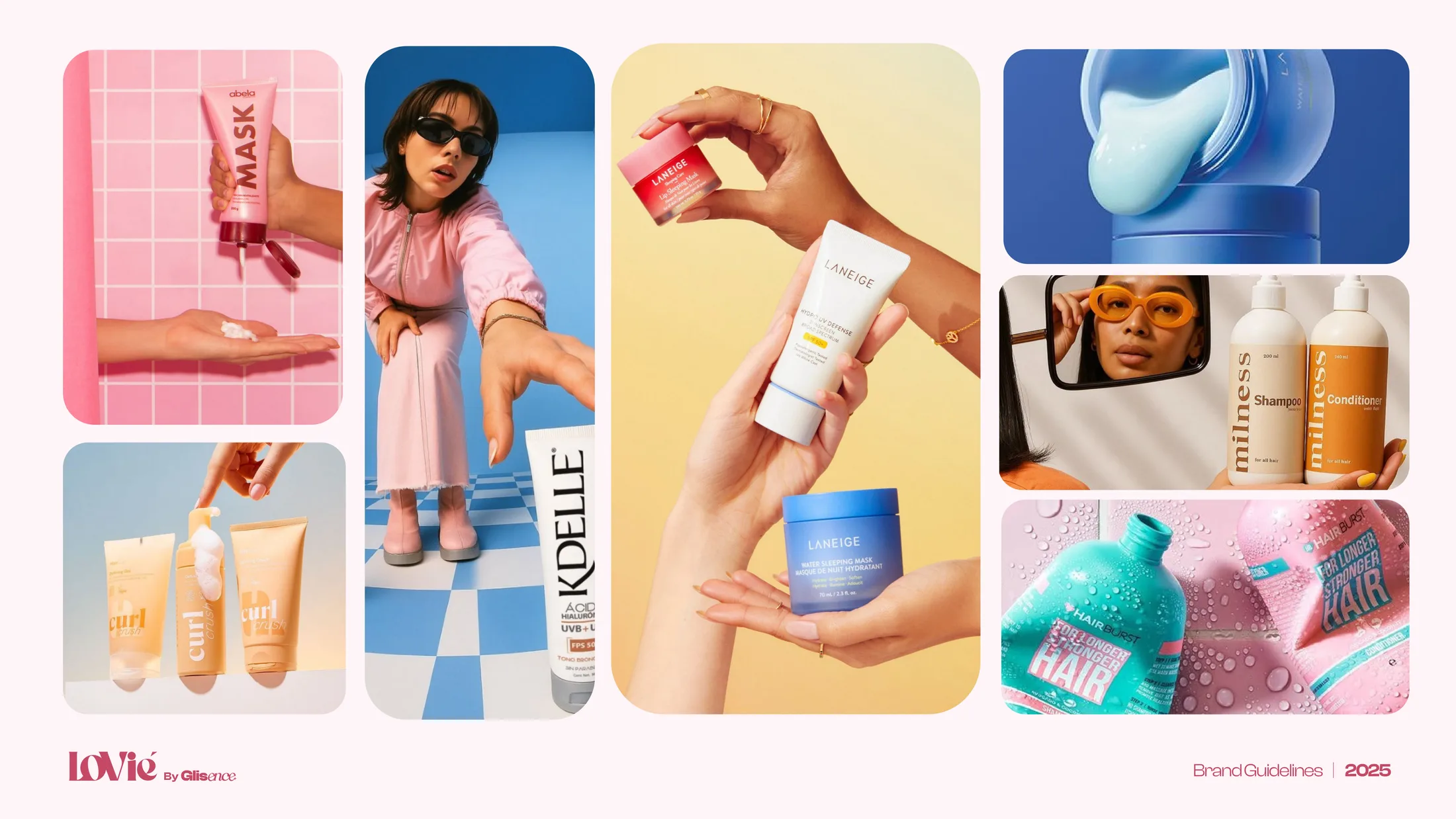
[ The benchmark — other brands’ work ]
The bar: the prestige tier she already scrolls — Rhode, Nécessaire, Ouai.
THE SYSTEM.
03 · An identity strangers can run
An operating standard — run without the designer in the room.
[ The mark — the anatomy ]
-
Why it survived
Legible at label size, ownable in a sans-serif feed, neutral above three worlds.
-
Why it scales
Primary, secondary, monogram — one page decides which appears where.
-
Why it fits premium
Two owned details — the ligature and the é — signal prestige without borrowing.
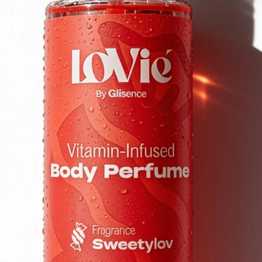
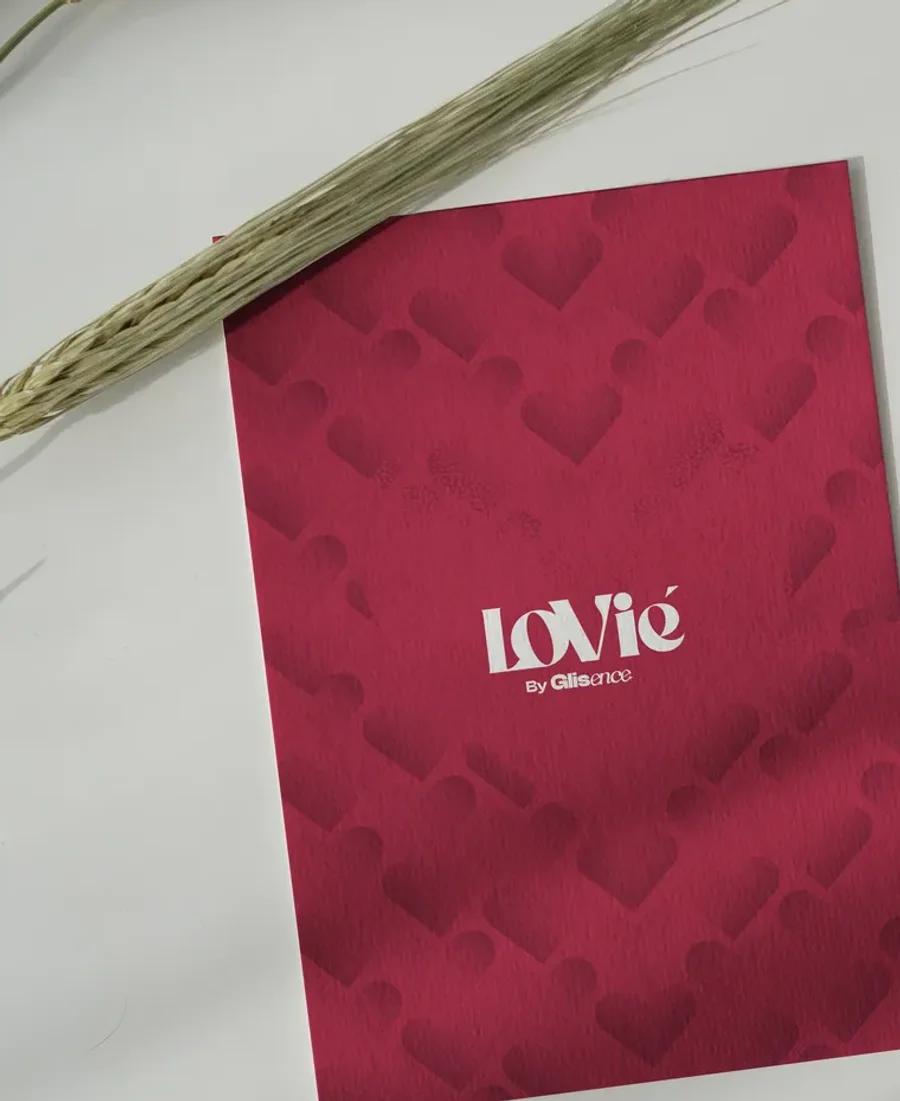
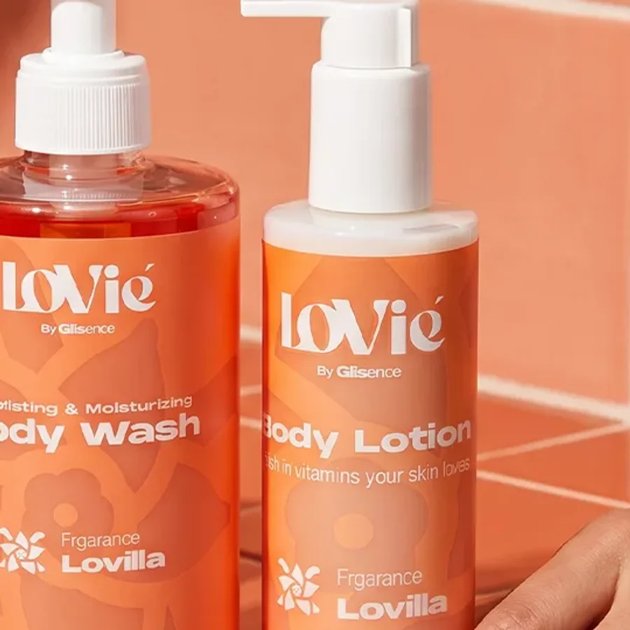
On the label. On the print. In the campaign.
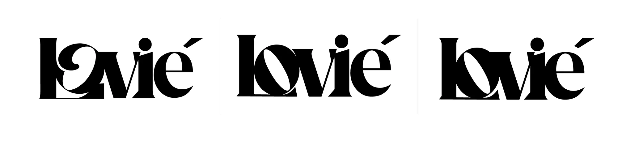
Rejected work is a cost, not a trophy.
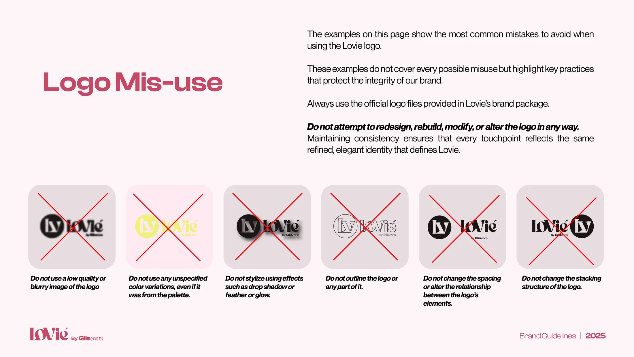
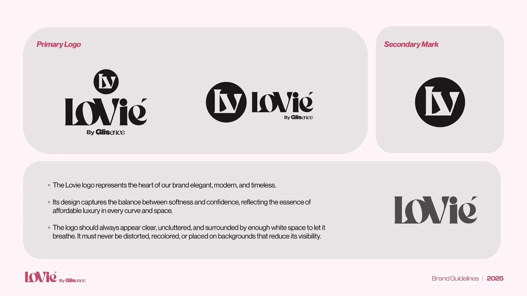
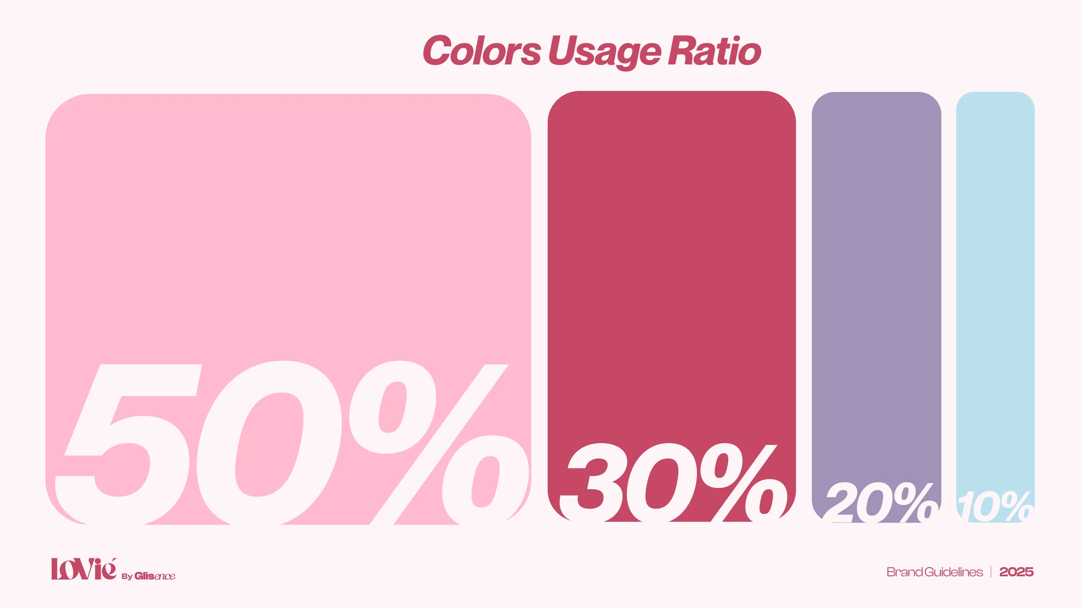
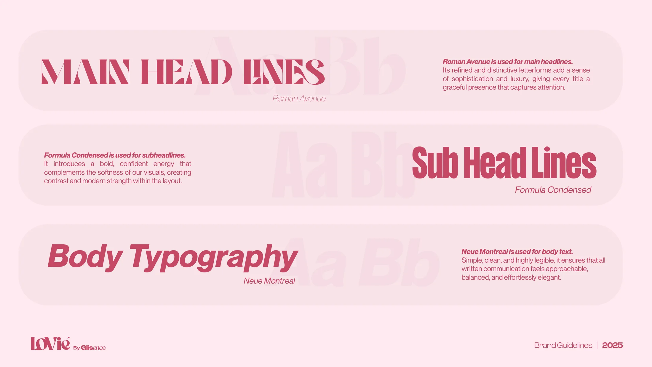
Forty pages so the brand survives its designer.
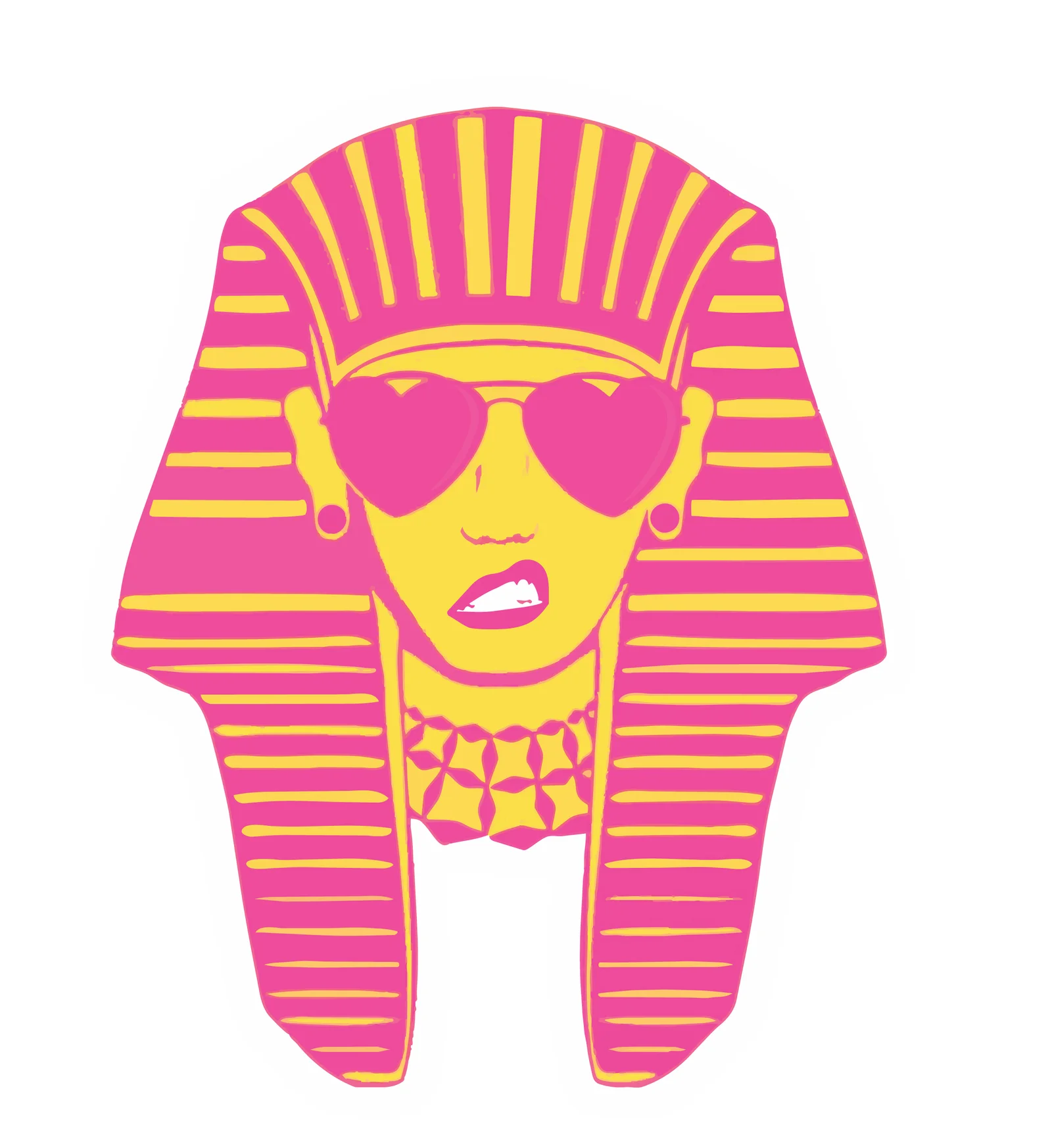
The local voice is the moat — no import can copy it.
THE OBJECT.
04 · Strategy, manufactured
The colour is the label. One construction serves the whole range.
[ Drawing → tooling → object ]
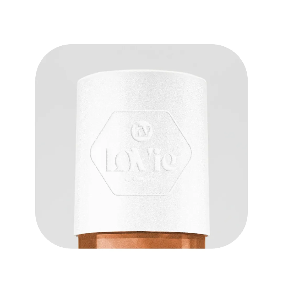
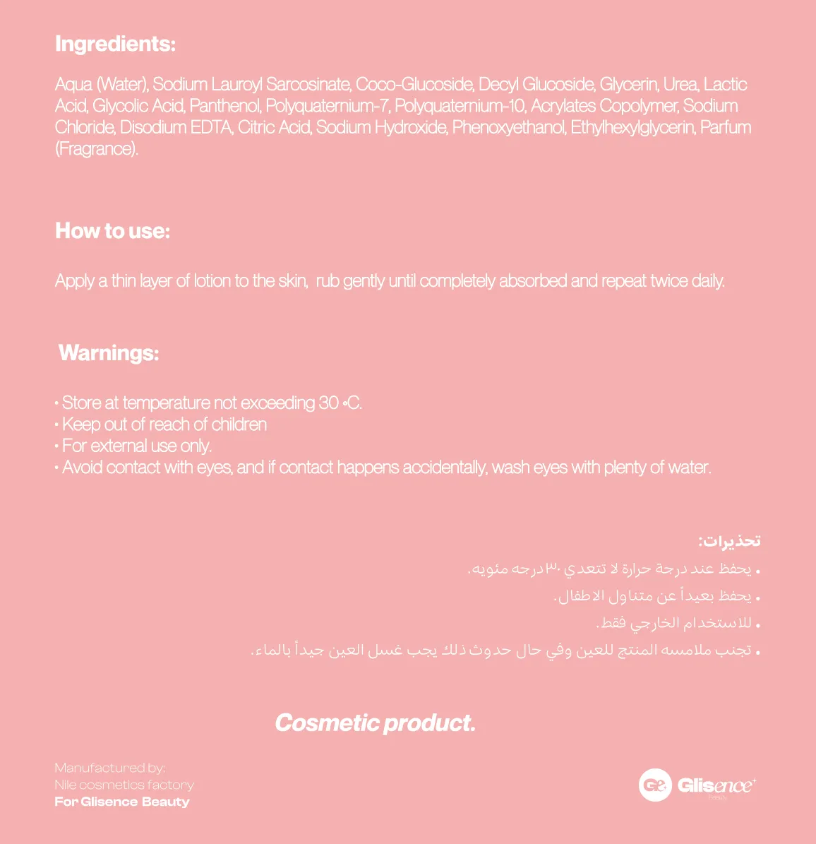
Bilingual, set and print-checked in-house.
Built for the gifting economy — an unboxing worth filming is unpaid media.
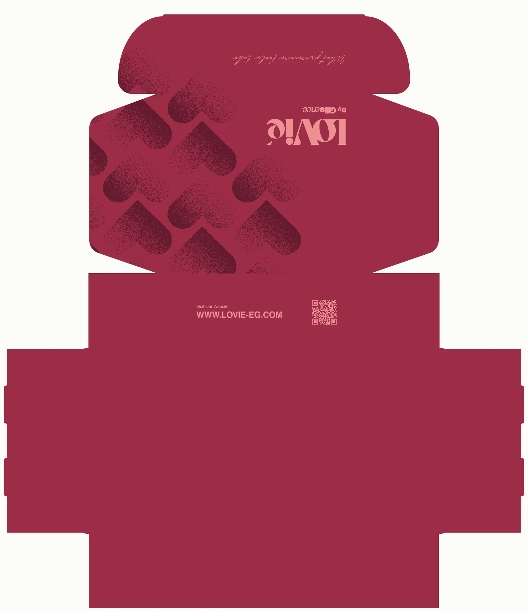
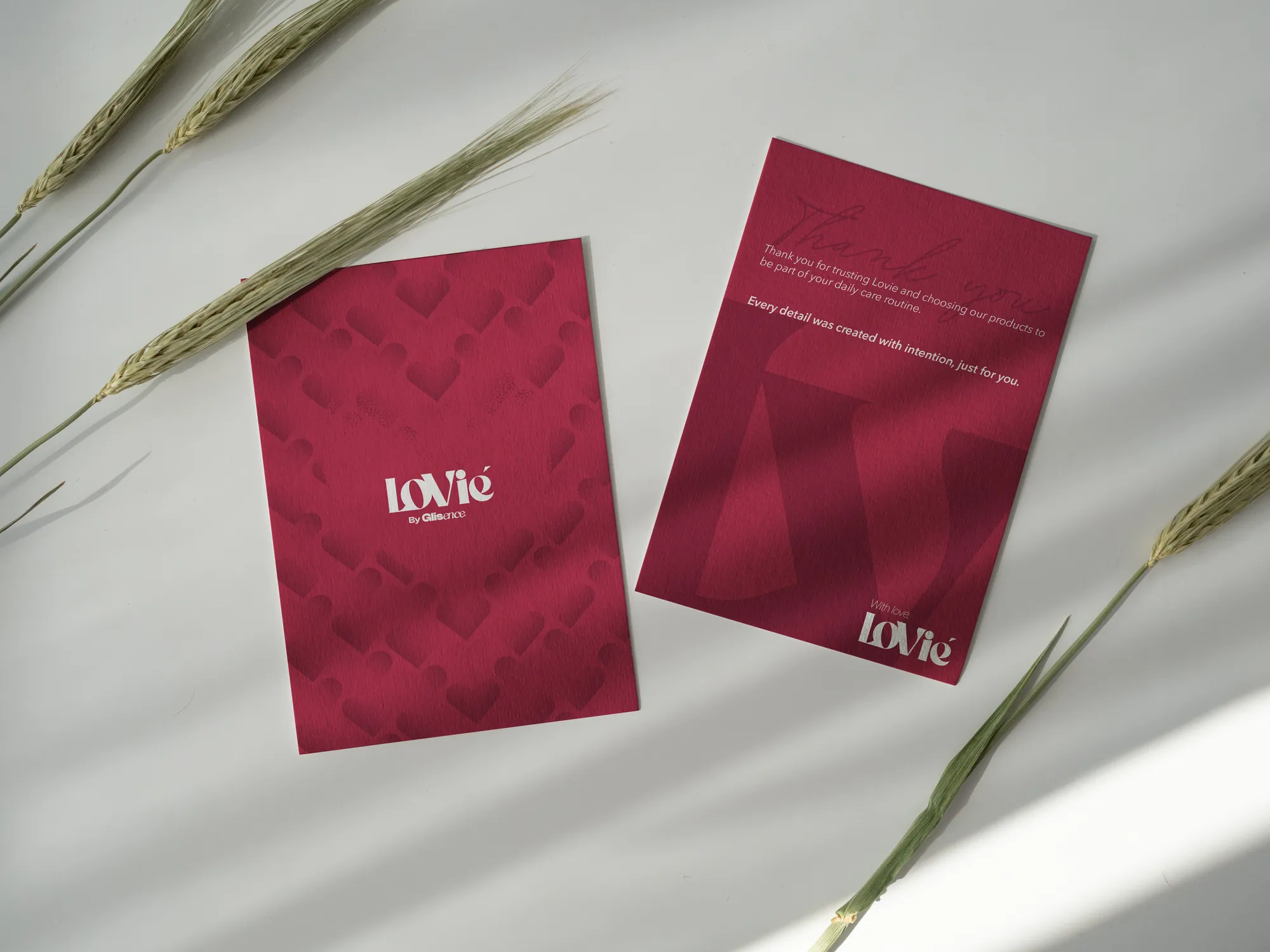
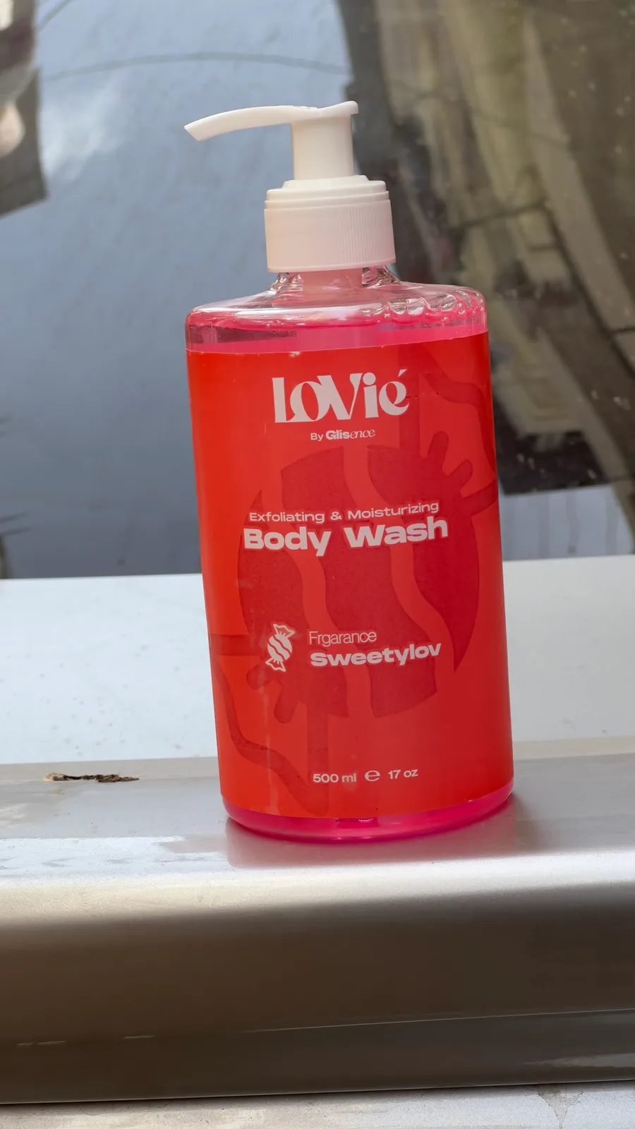
Cairo daylight — printed, filled, real.
THE EXECUTION.
05 · Production, not one-offs
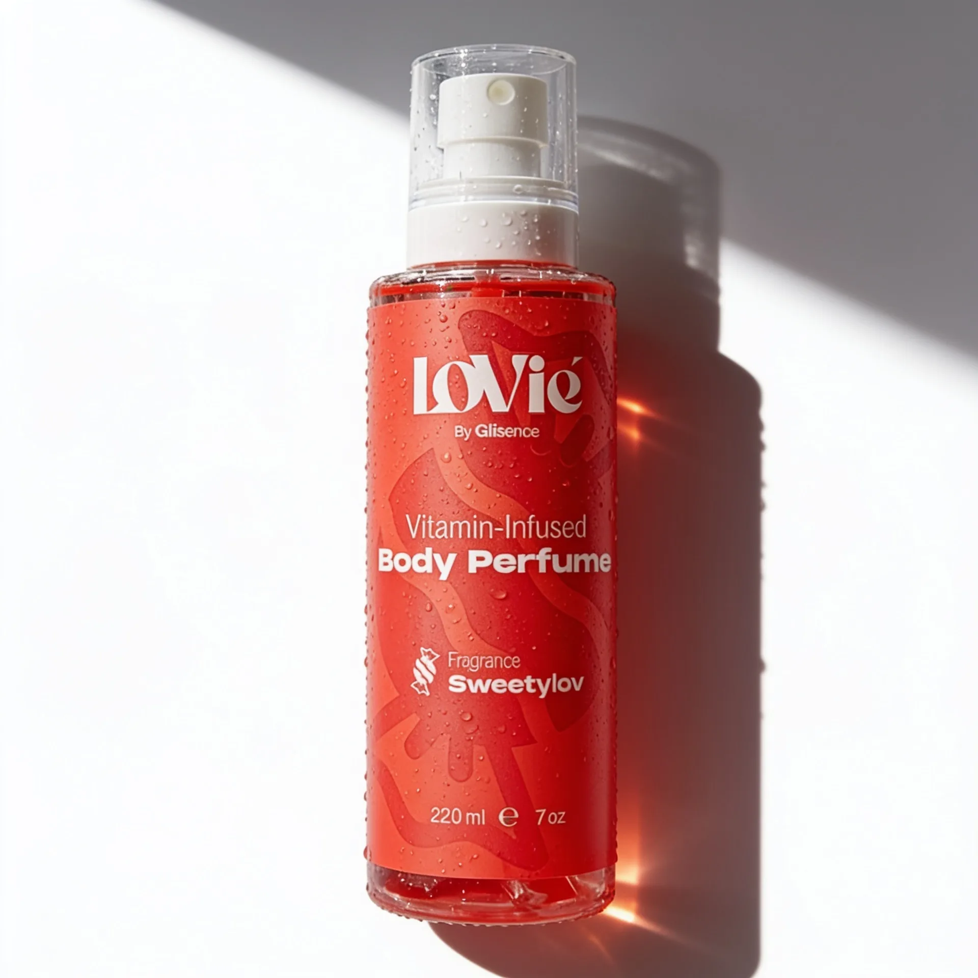
The clear bottle lit so its liquid glows, on a ground tuned to its line colour.
01One soft key at 30–45°; the single shadow is part of the composition.
02Light the liquid — a soft kick from behind makes the colour the hero.
03Glossy, not flat — wet reads as premium.
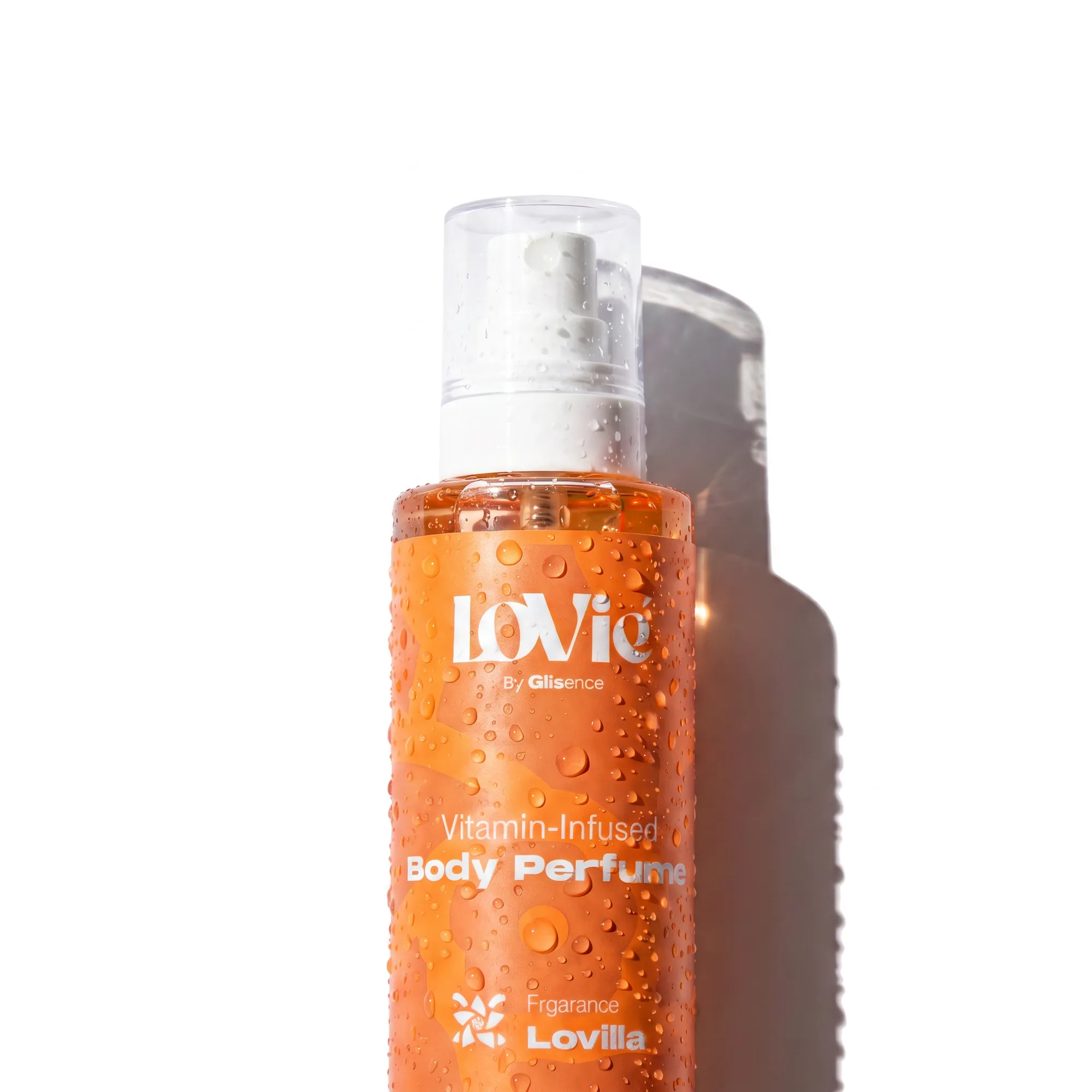
04Never pure white, never cold grey. Shoot warm.
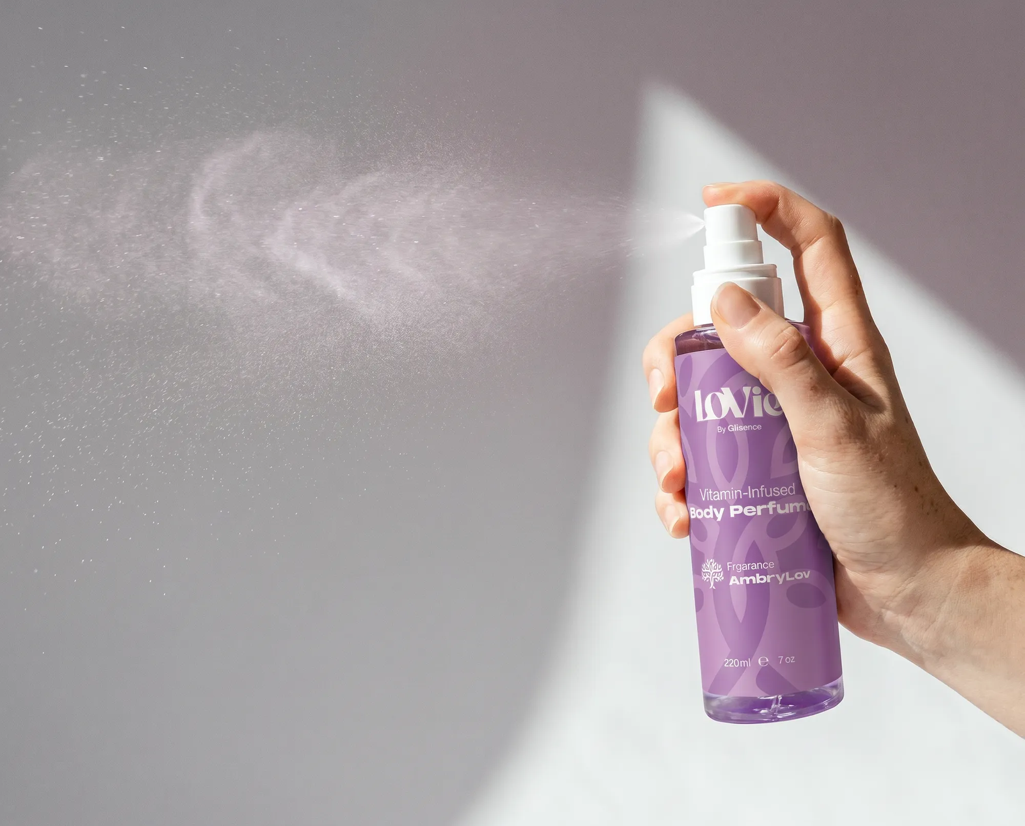
New SKUs enter the store matching the frames that sold the old ones.
[ The ad system ]
Twelve formats, thirty-six variations. 110 briefed ads before spend.
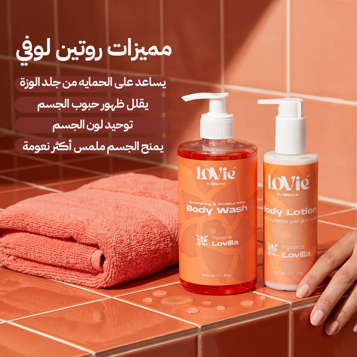
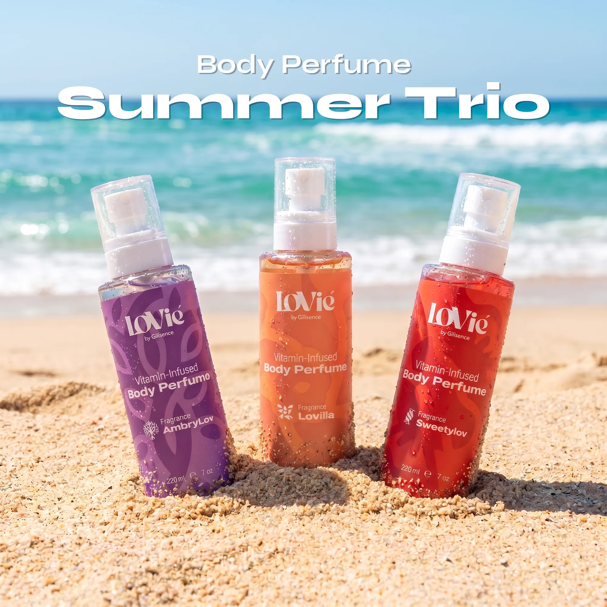
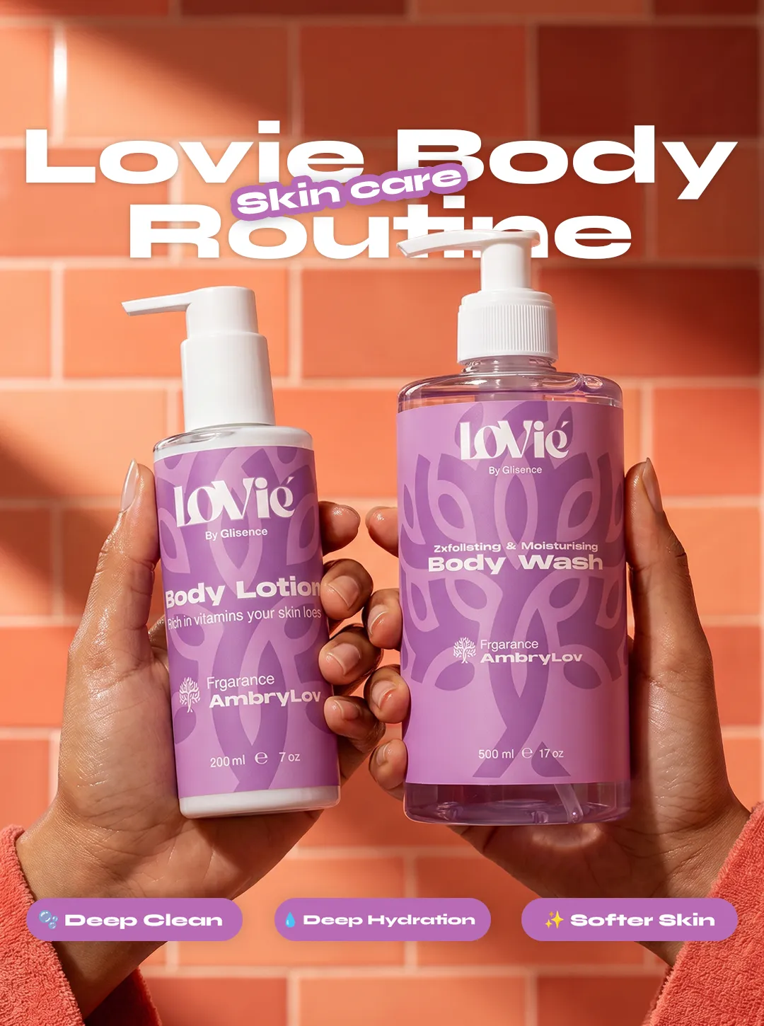
One template, three worlds — swap colour and accords.
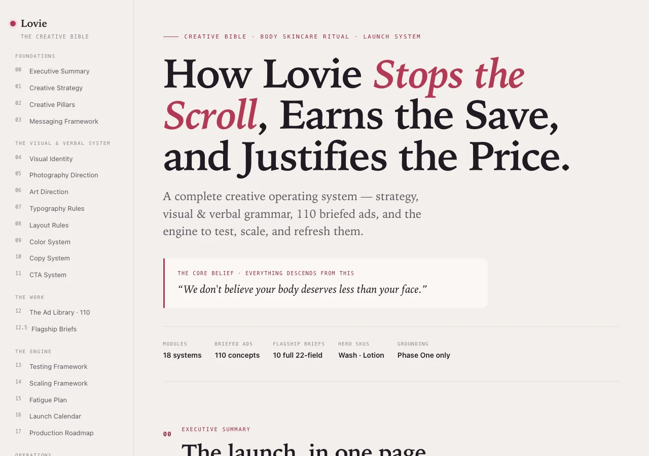
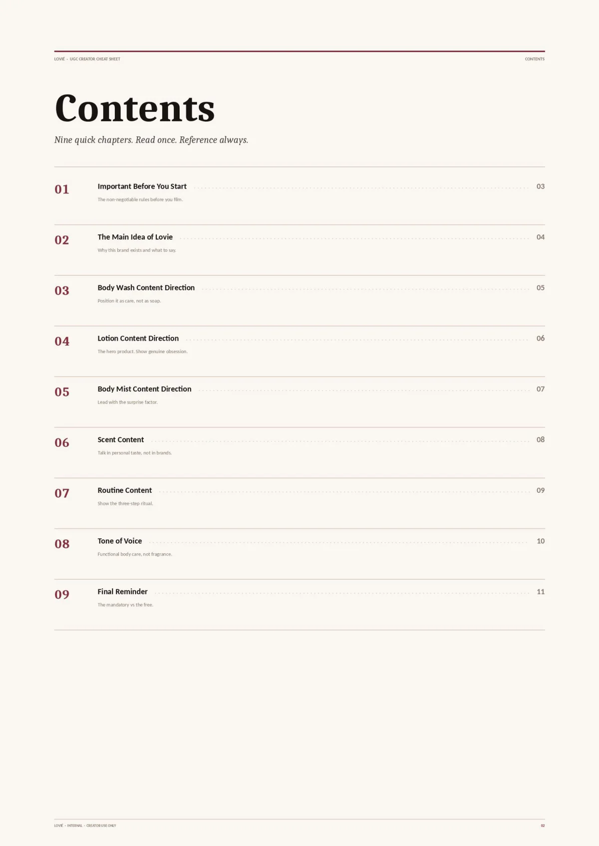
Briefed, documented, delegable.
THE MARKET.
06 · Where brand meets revenue
Arabic first, pounds, cash on delivery — how Egypt buys.
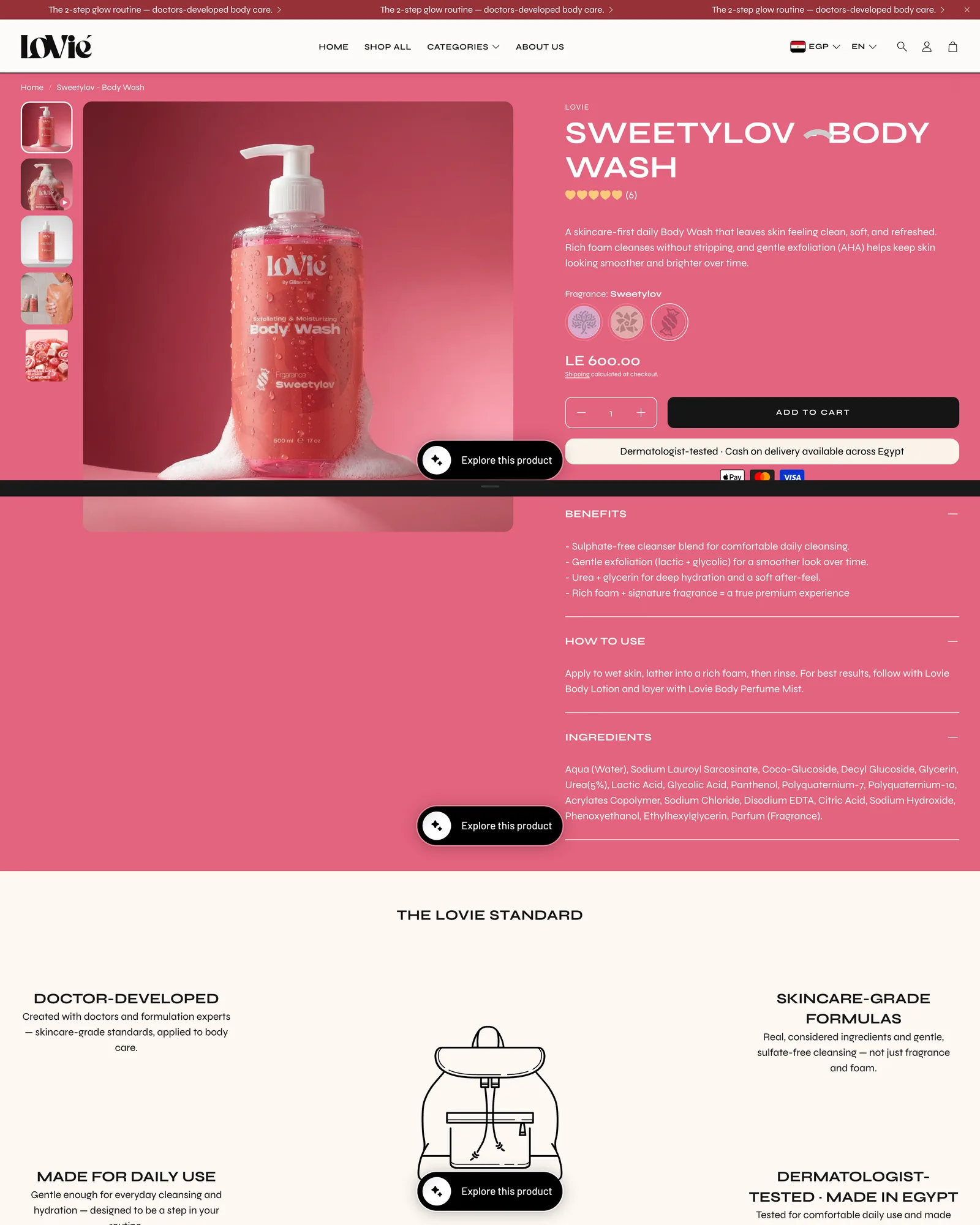
[ The offer ladder — every rung has a job ]
-
Entry
Body Routine — EGP 699
“Just let me try it” traffic — never the hero.
-
Hero
The Double Routine — EGP 999
Every ad lands here — the order value that makes cash-on-delivery survivable.
-
Discovery
Signature Collection — EGP 749
Three worlds in one box — for the scent-hesitant.
-
Upsell
Add the mist — in cart
Lifts the order without touching the hero.
Bundle economics, not discounts.
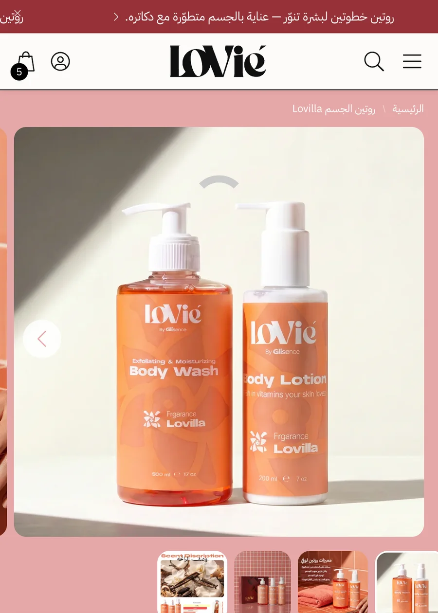
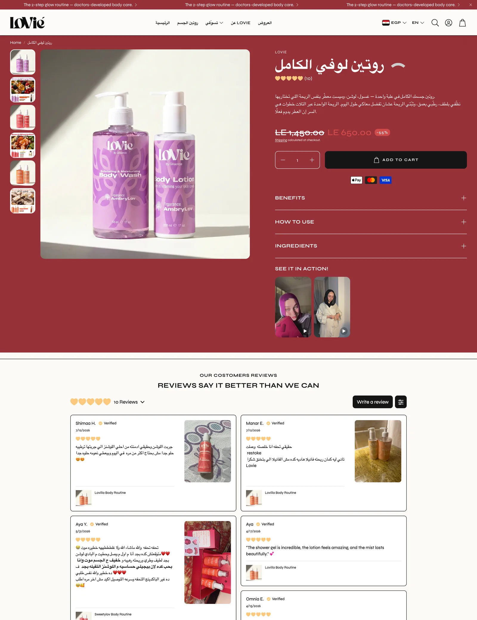
[ The angle matrix ]
-
The one moment that’s yours
The me-time ritual — the brand hero.
-
Skin-science proof
The conversion workhorse.
-
The price reframe
Cost per shower, not price per bottle — the objection killer.
-
Three scent worlds
Separate entries — the segmentation engine.
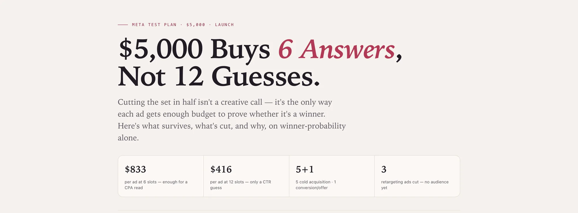
Six ads funded to a real answer — kill rules before the first pound.
The operational layer stays off this page — it carries live business numbers.
THE BRAND LIVED.
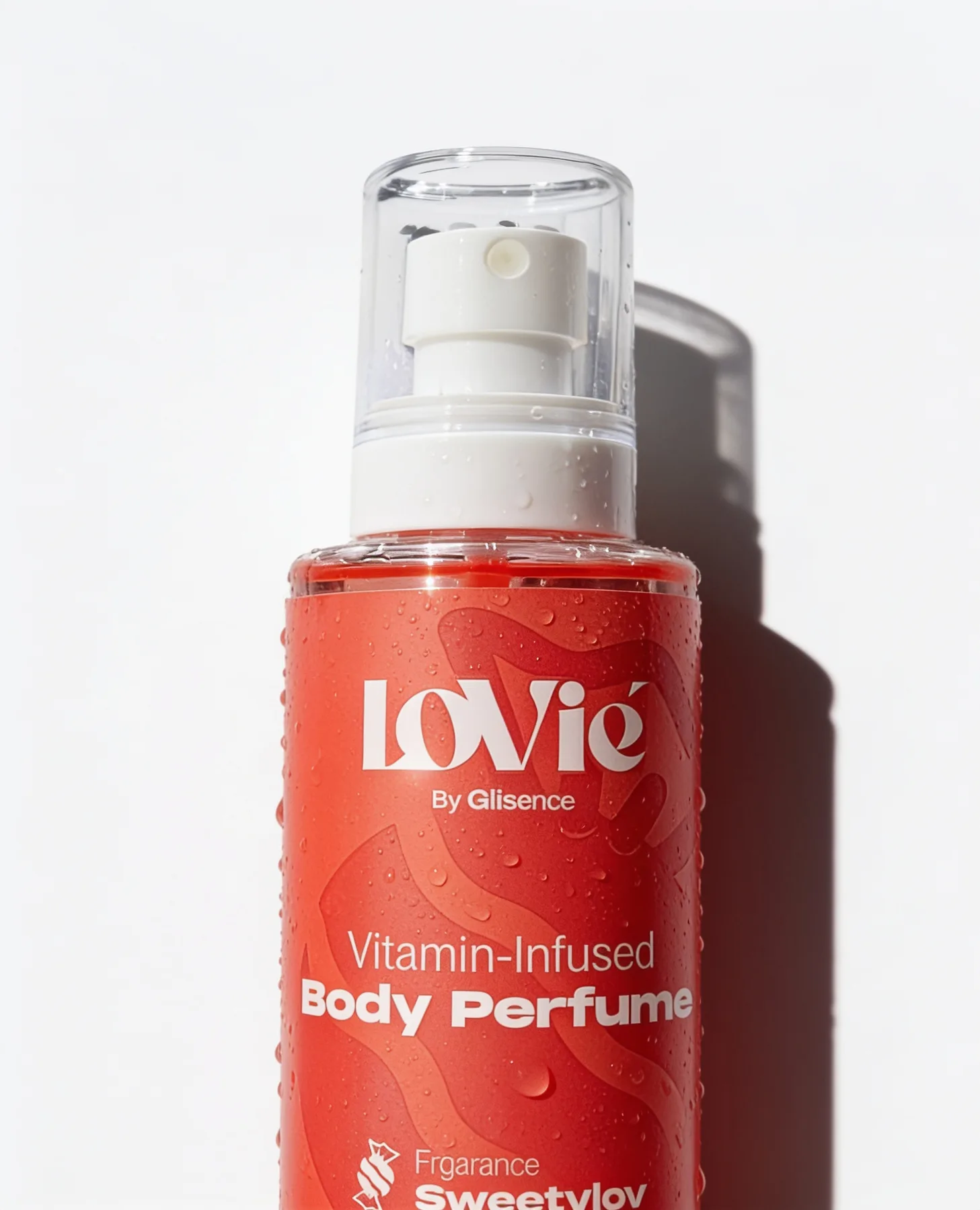
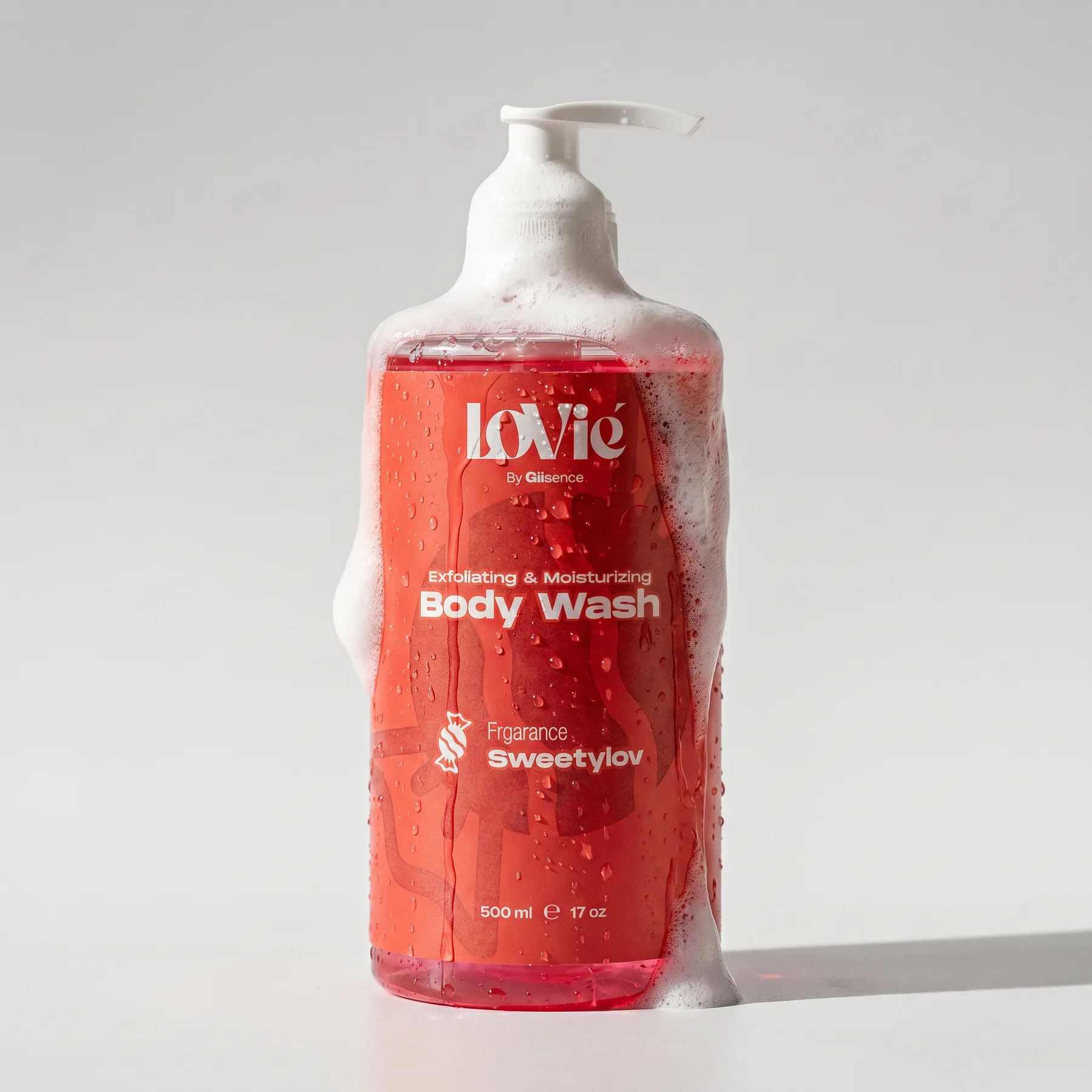
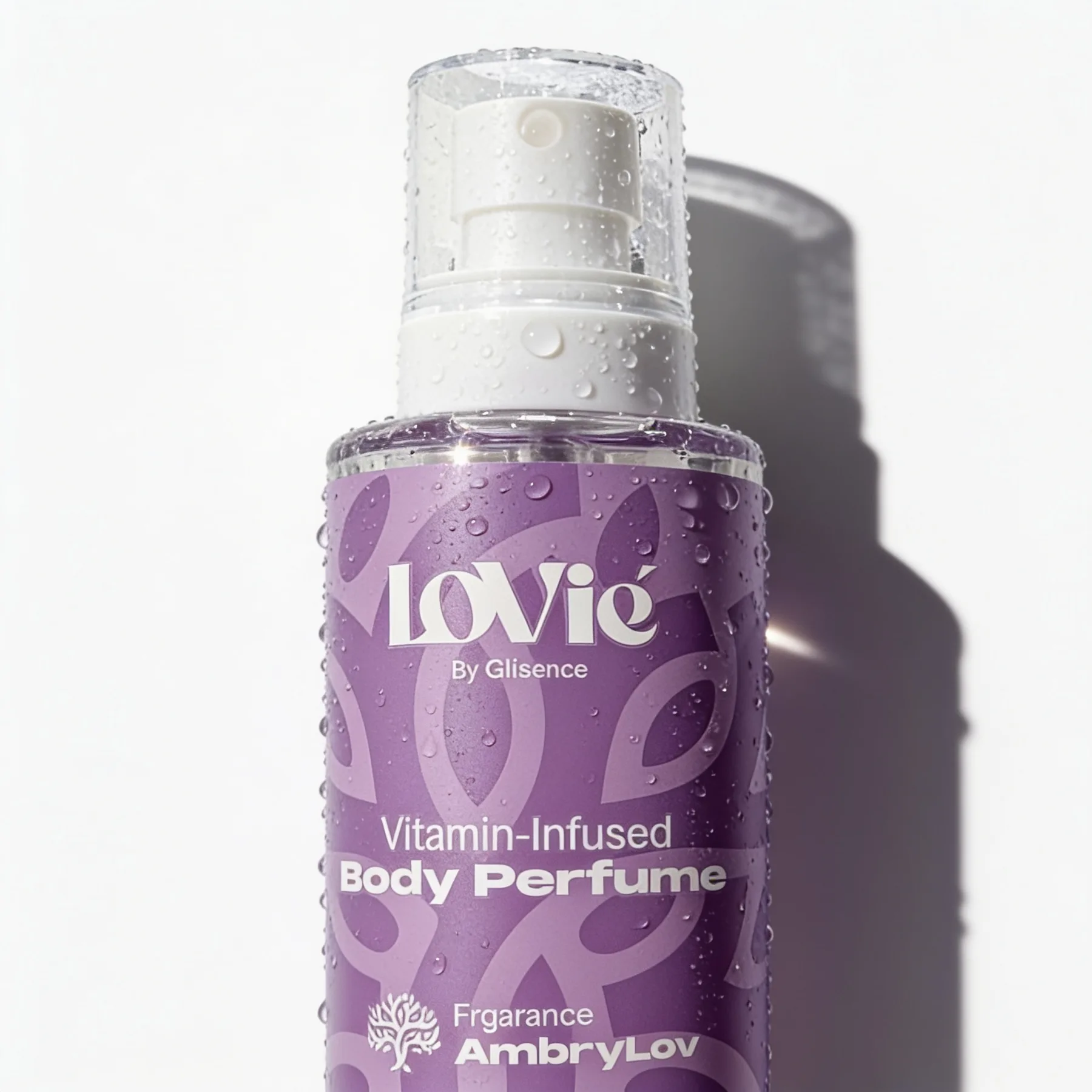
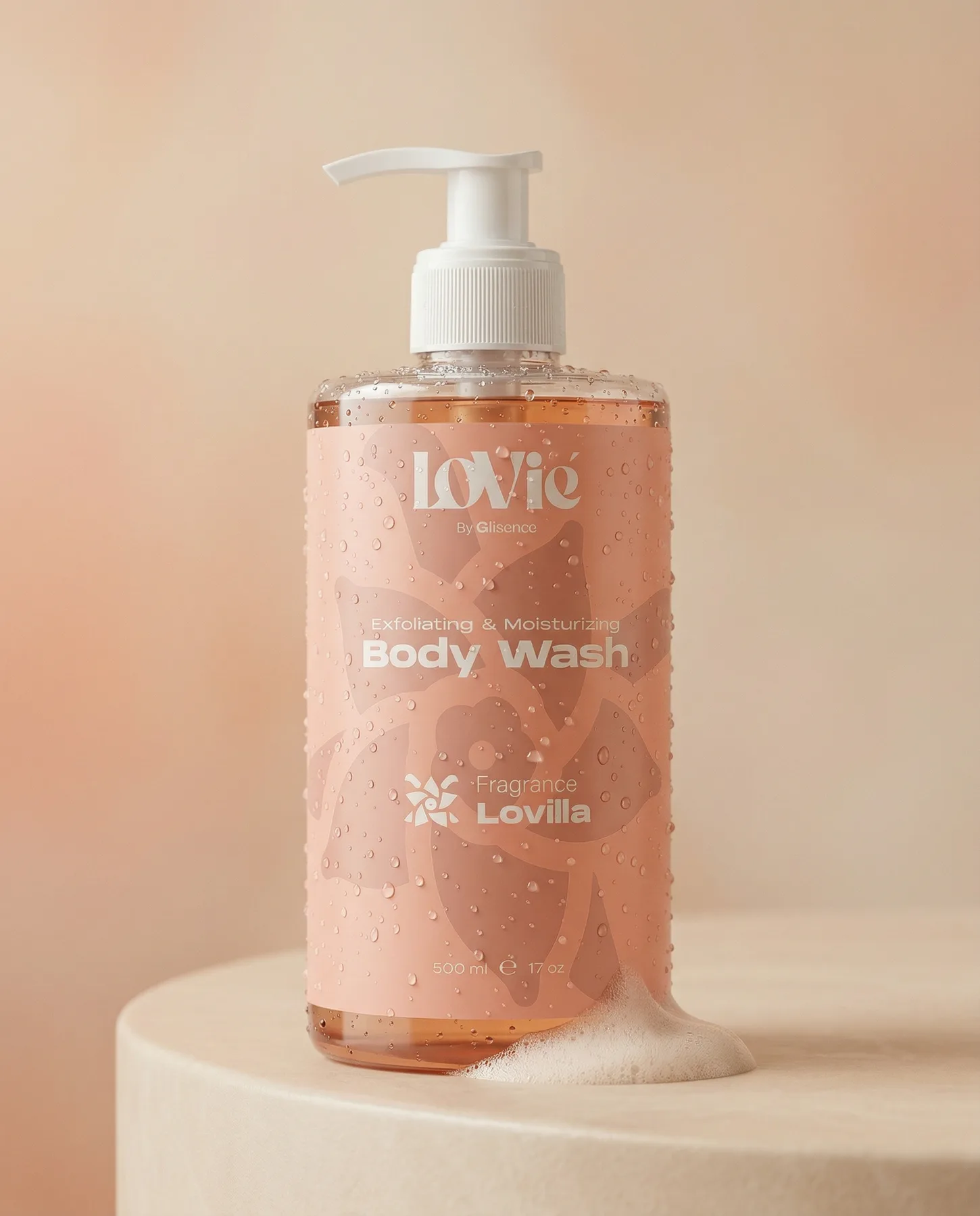
07 · The finished work, at full scale
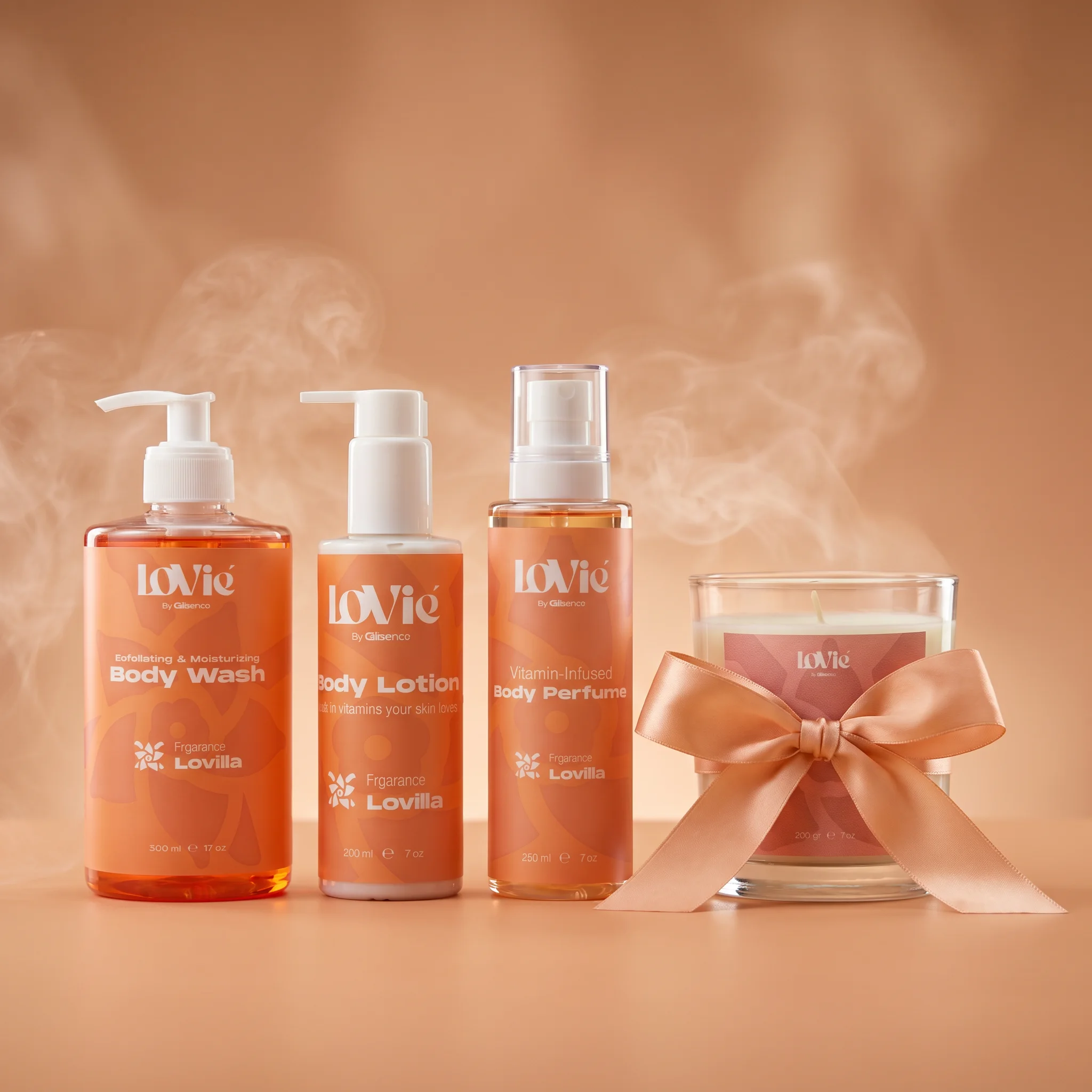
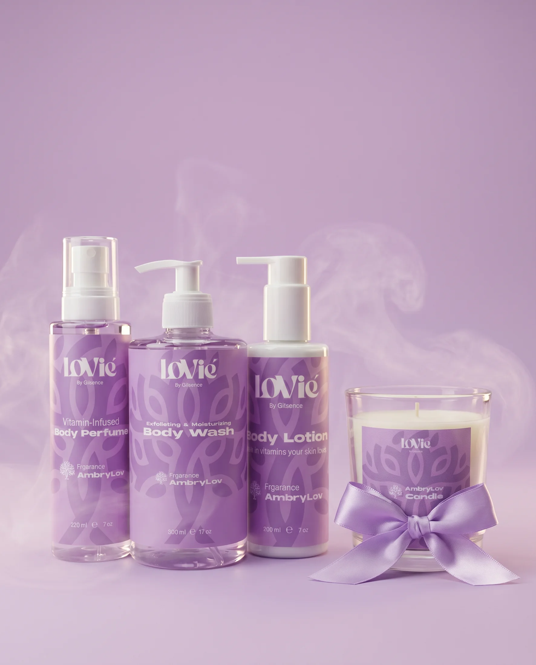
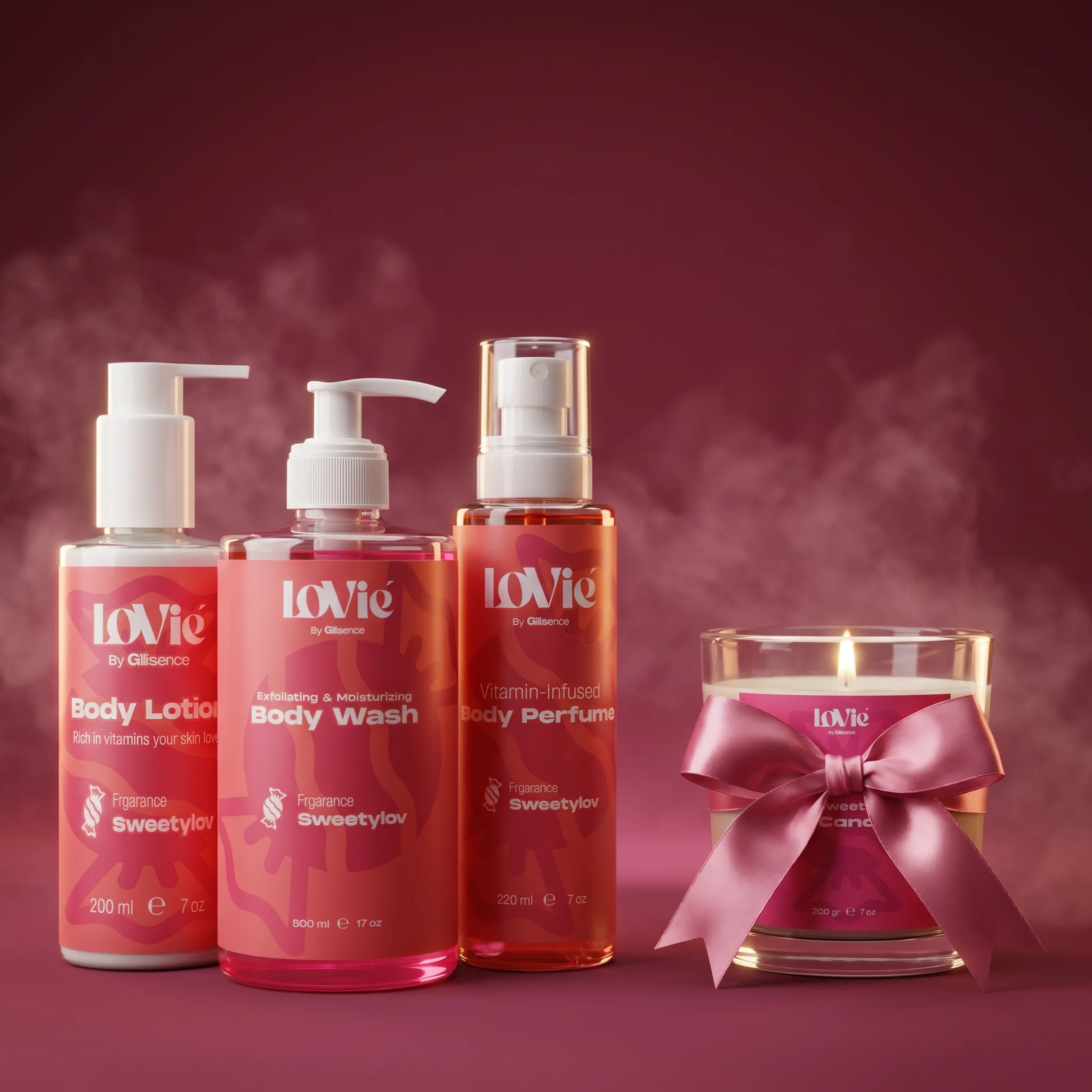
Built for the occasions the strategy named.
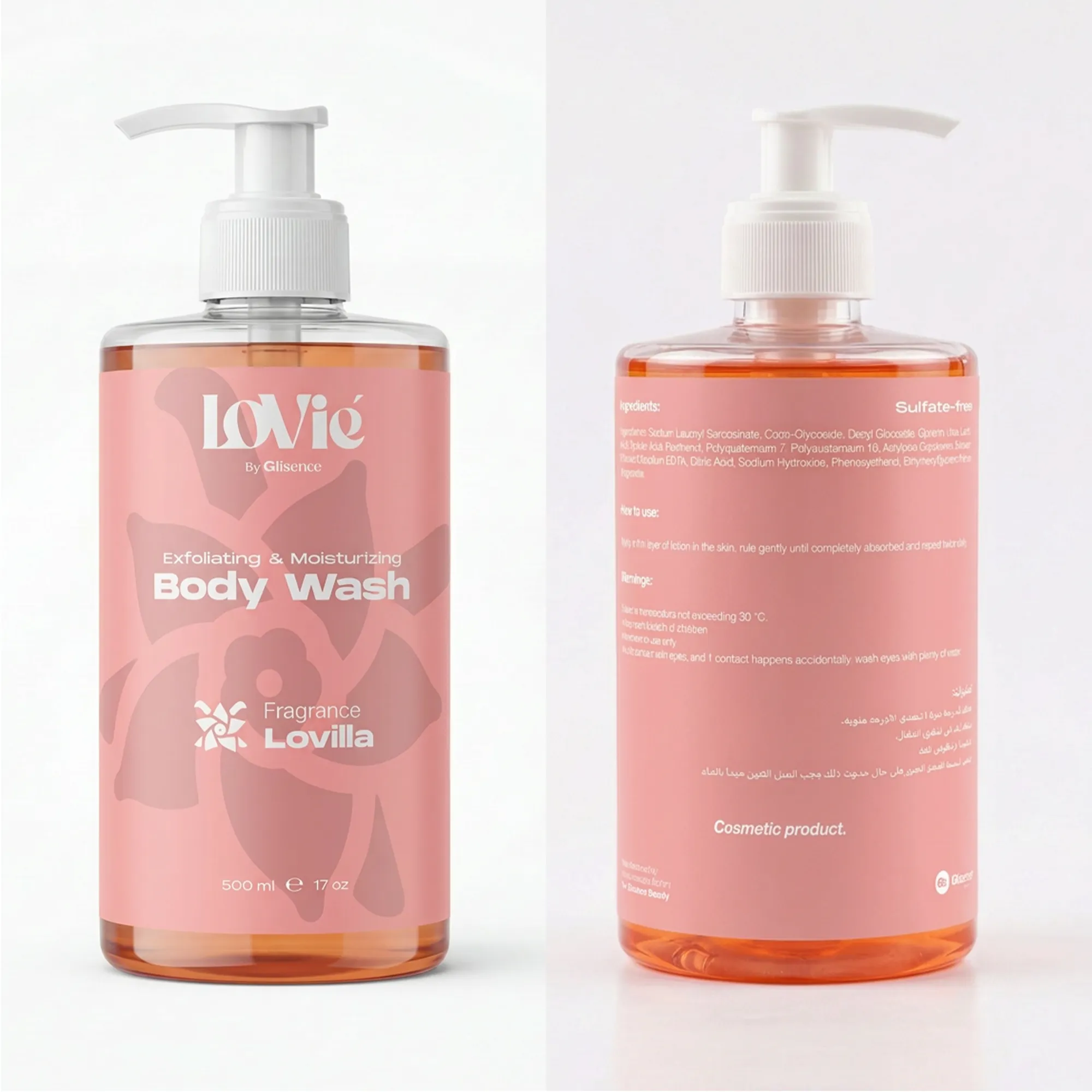
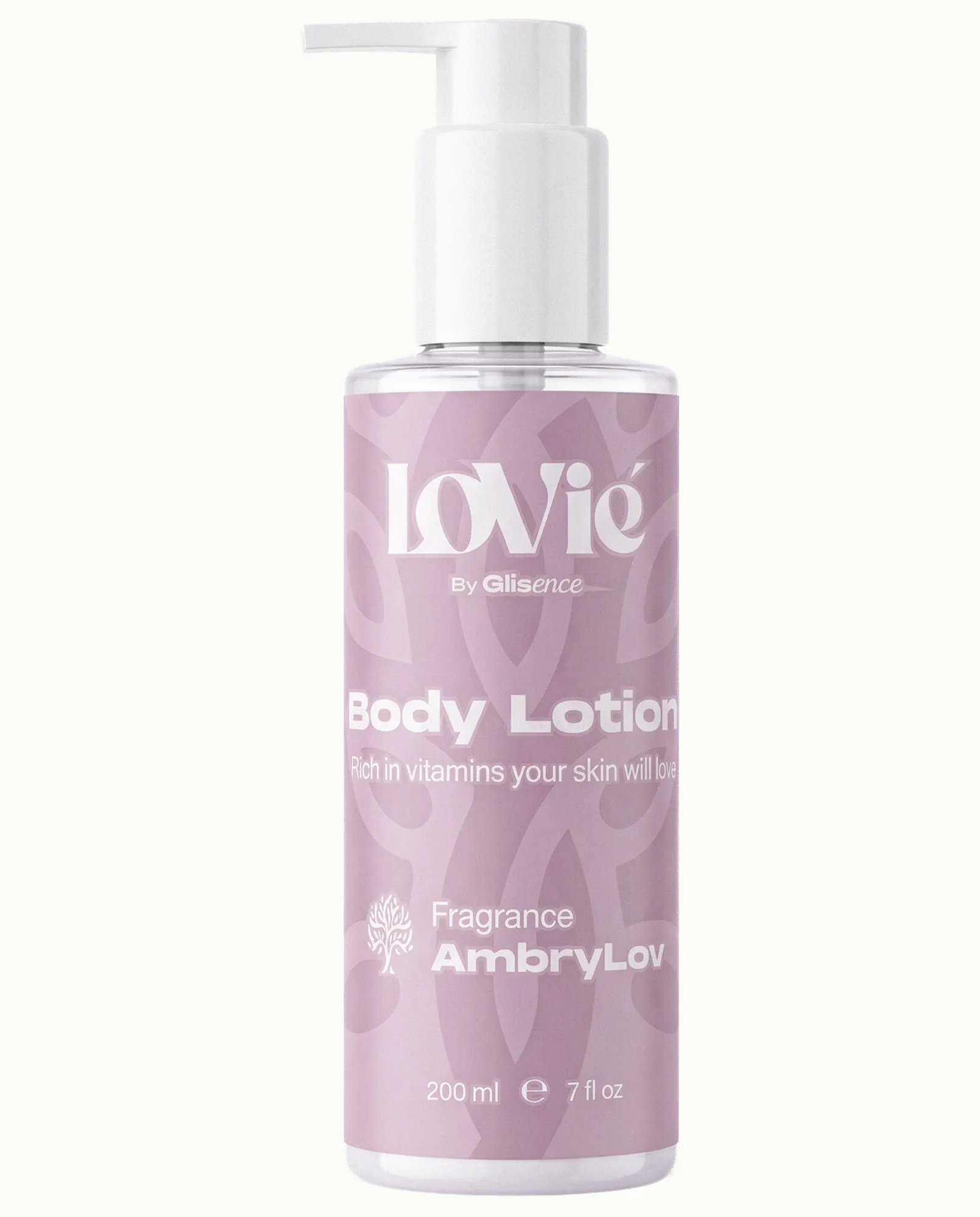
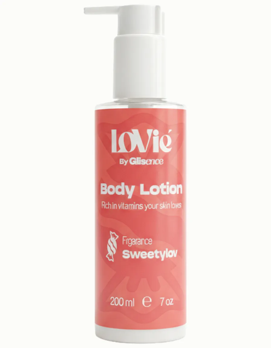
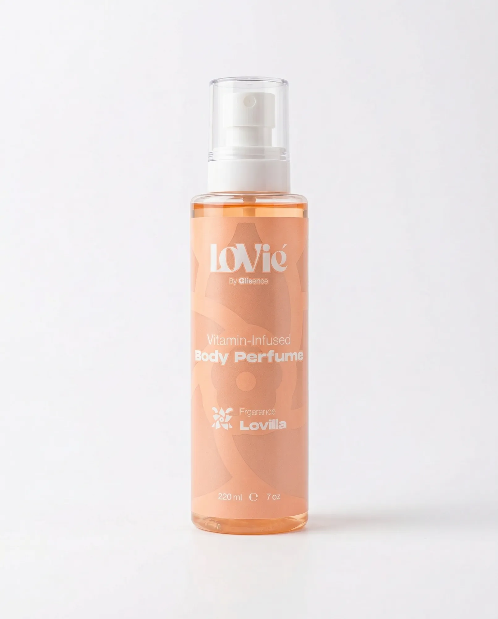
The shelf reads as one brand.
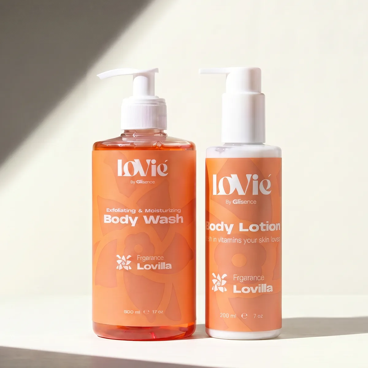
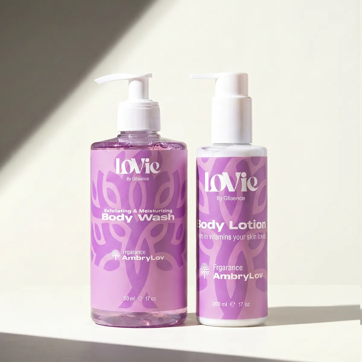
THE CAMPAIGN.
08 · Two frames, twenty-four assets
No shoot was booked. Two phone frames of the first printed bottles — a car roof, a Cairo street, the ingredients side out — are the source of every asset below. The bottle was re-lit, re-placed and re-staged from those two frames alone.
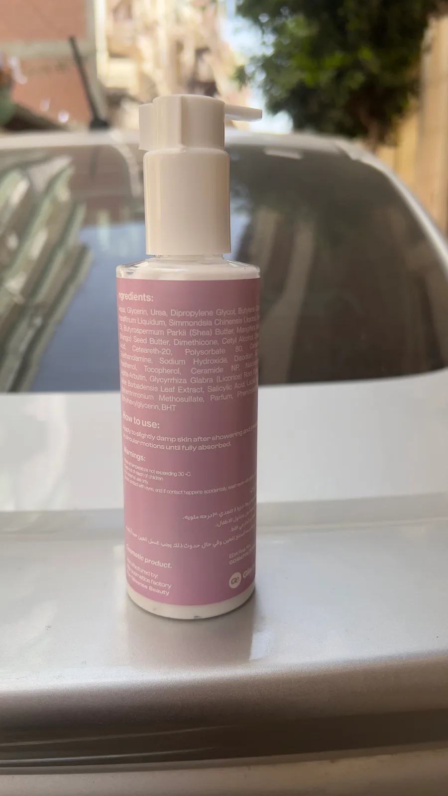
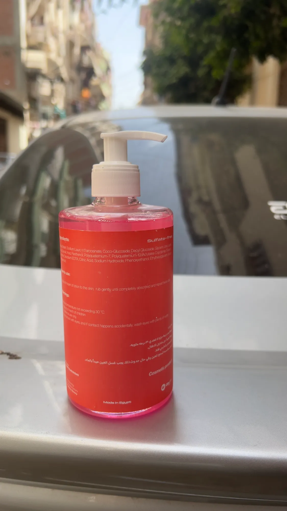
Out of the studio entirely. Everything below starts here.
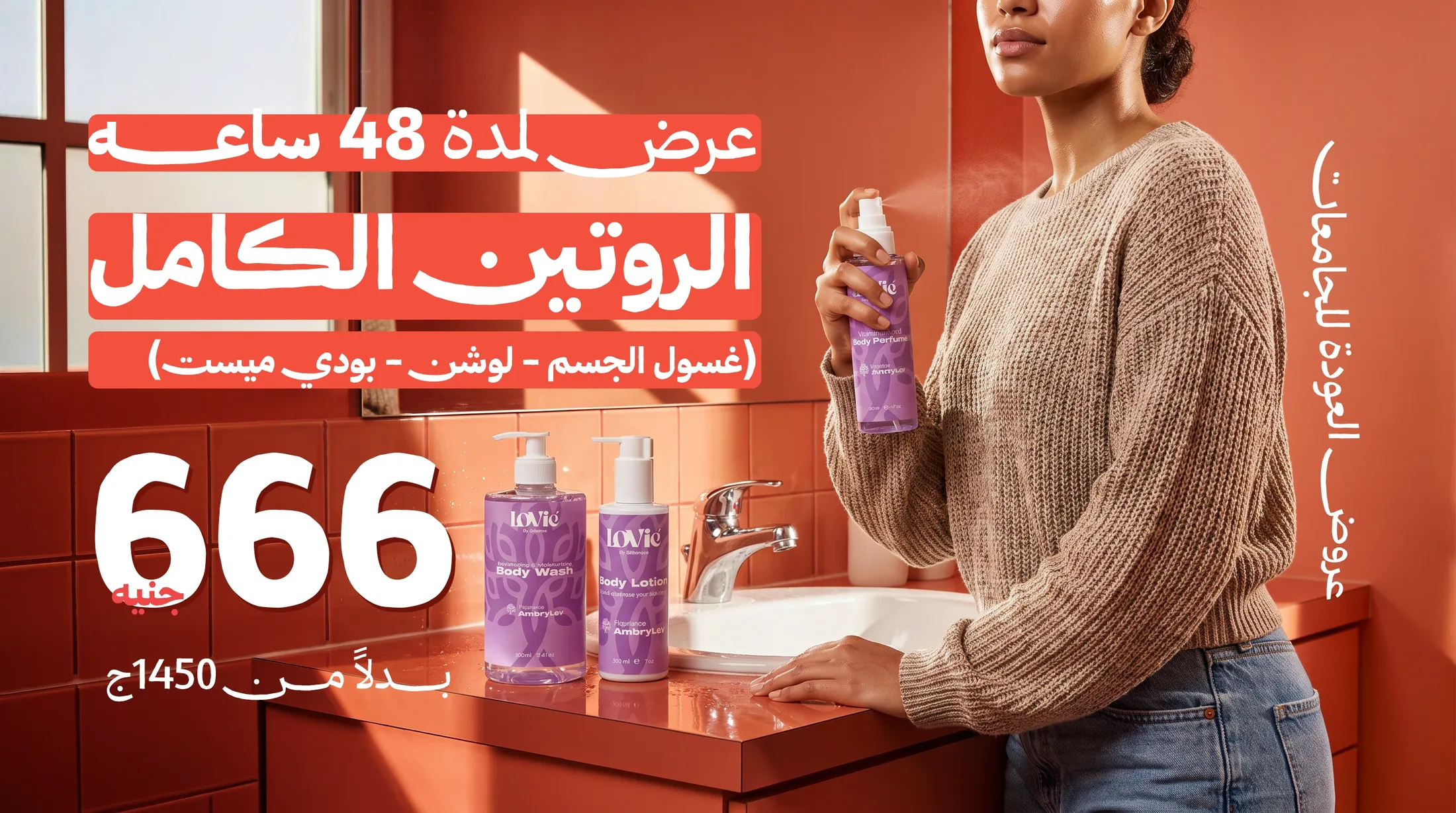
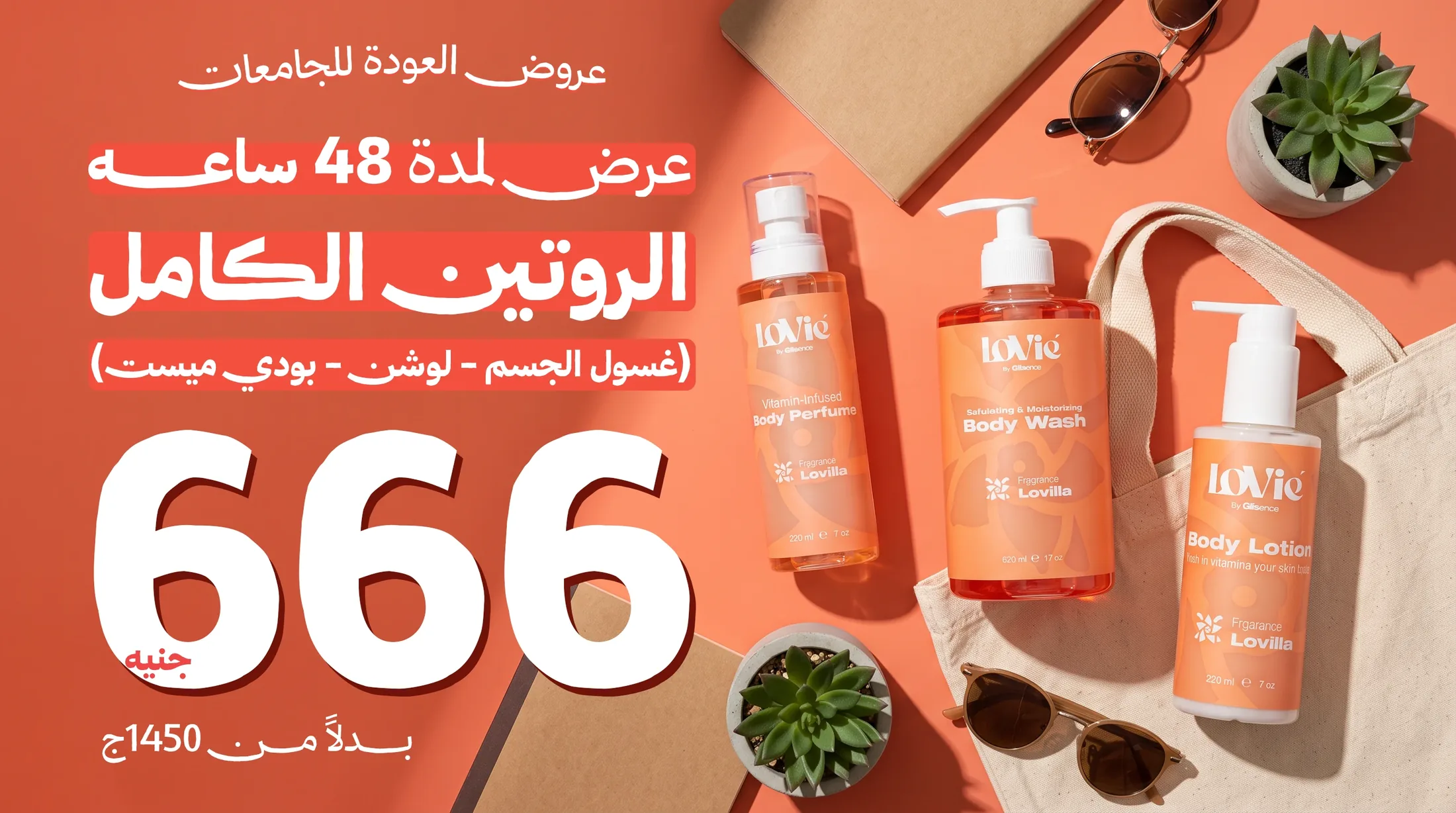
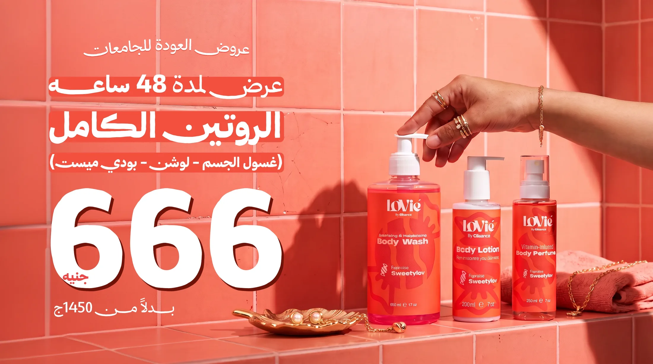
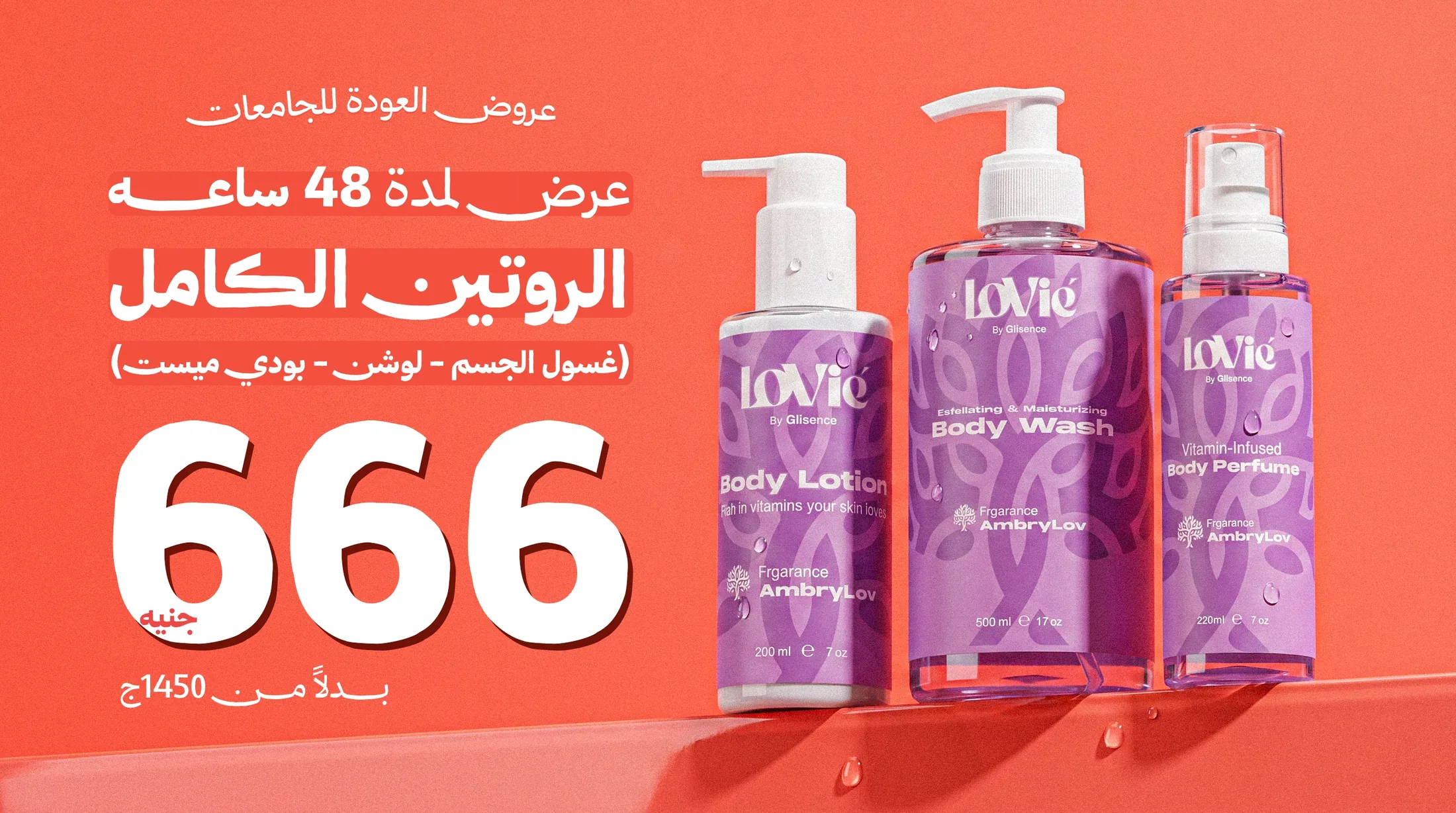
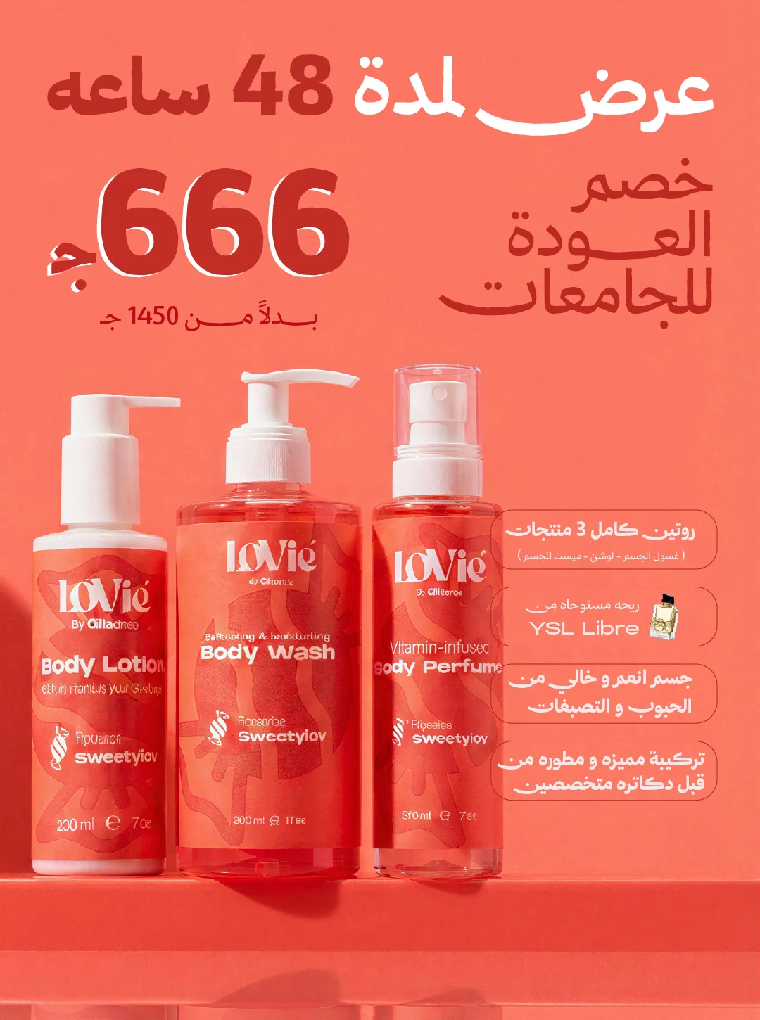
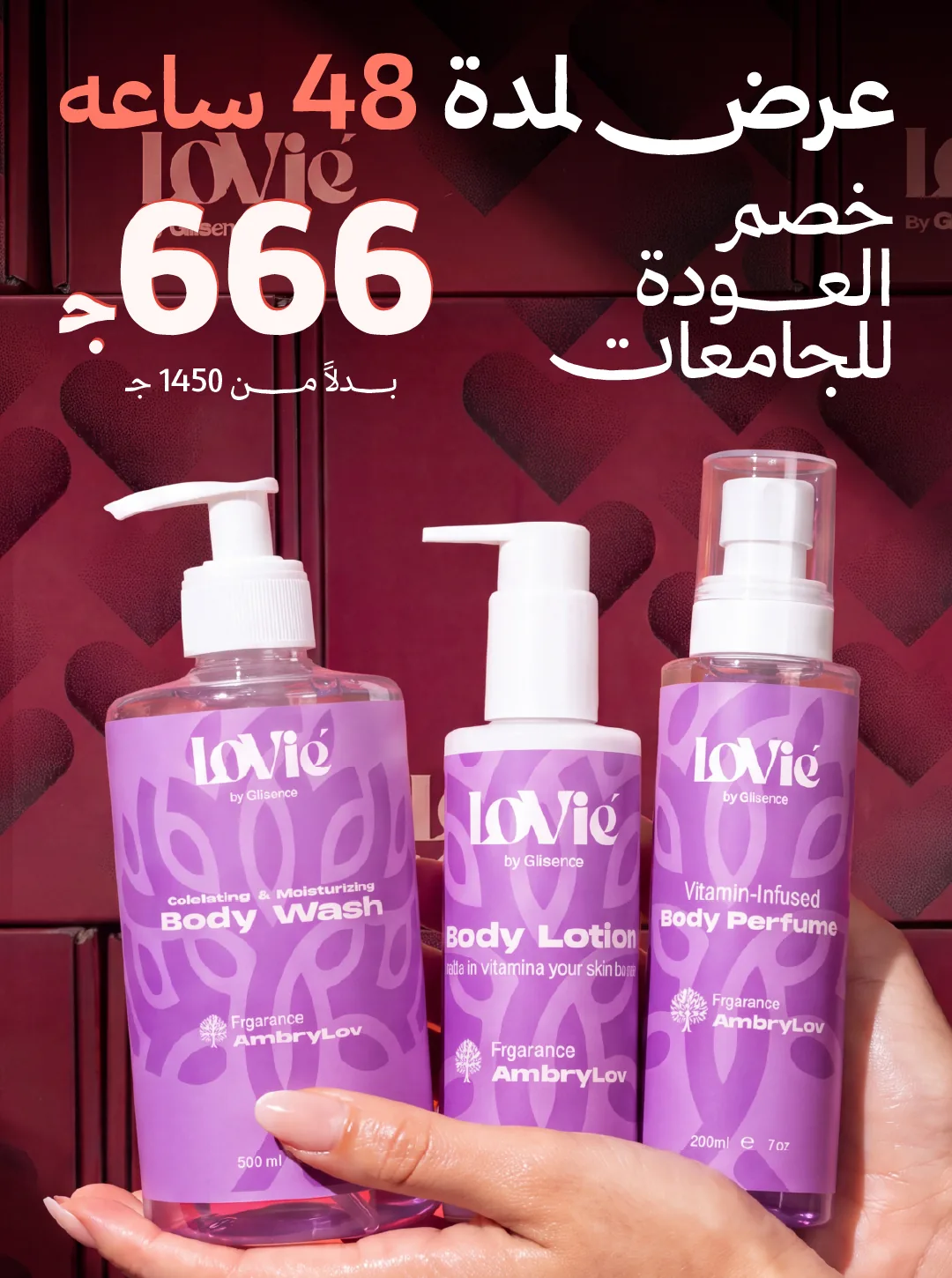
One offer, four rooms.
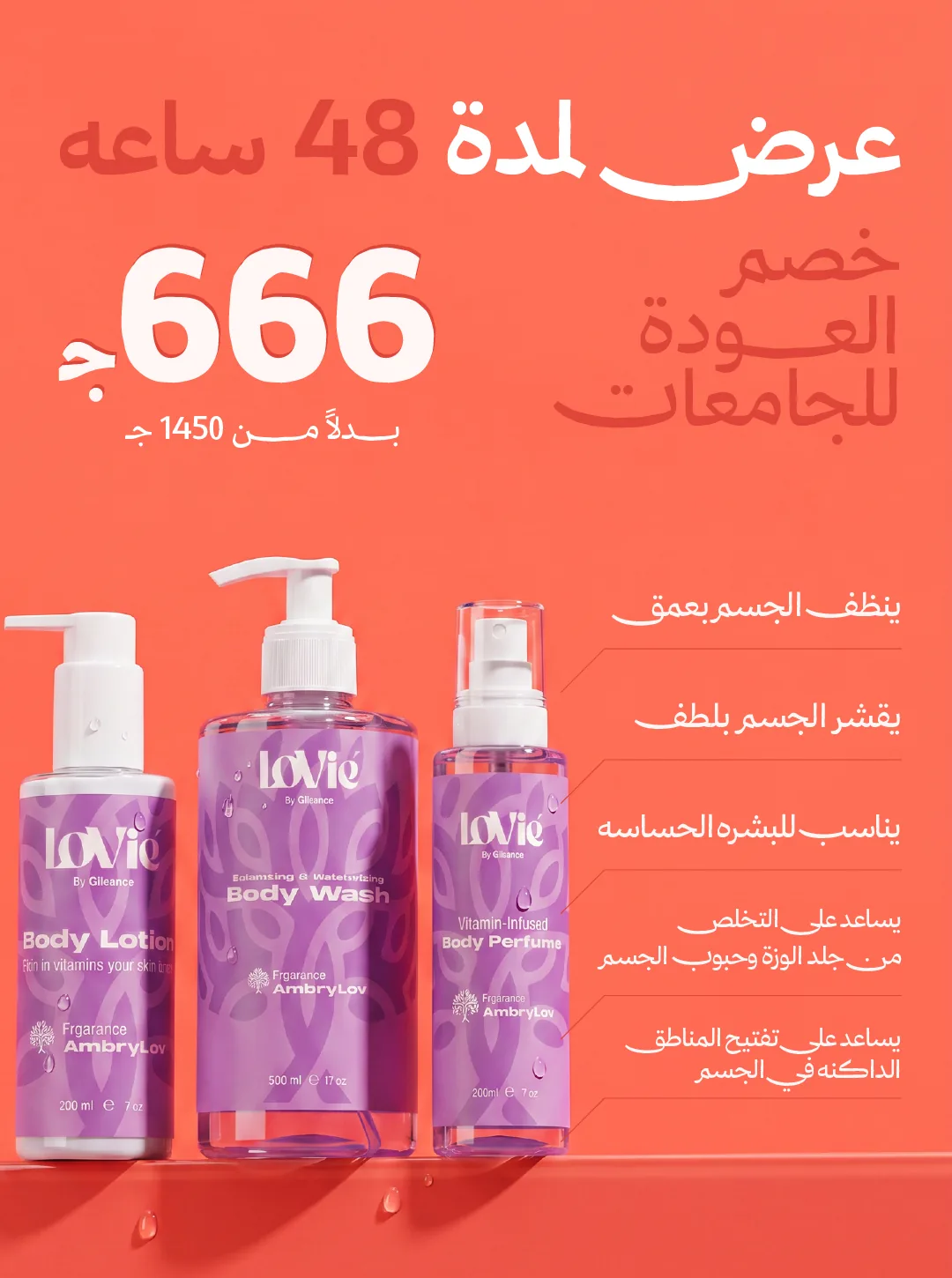
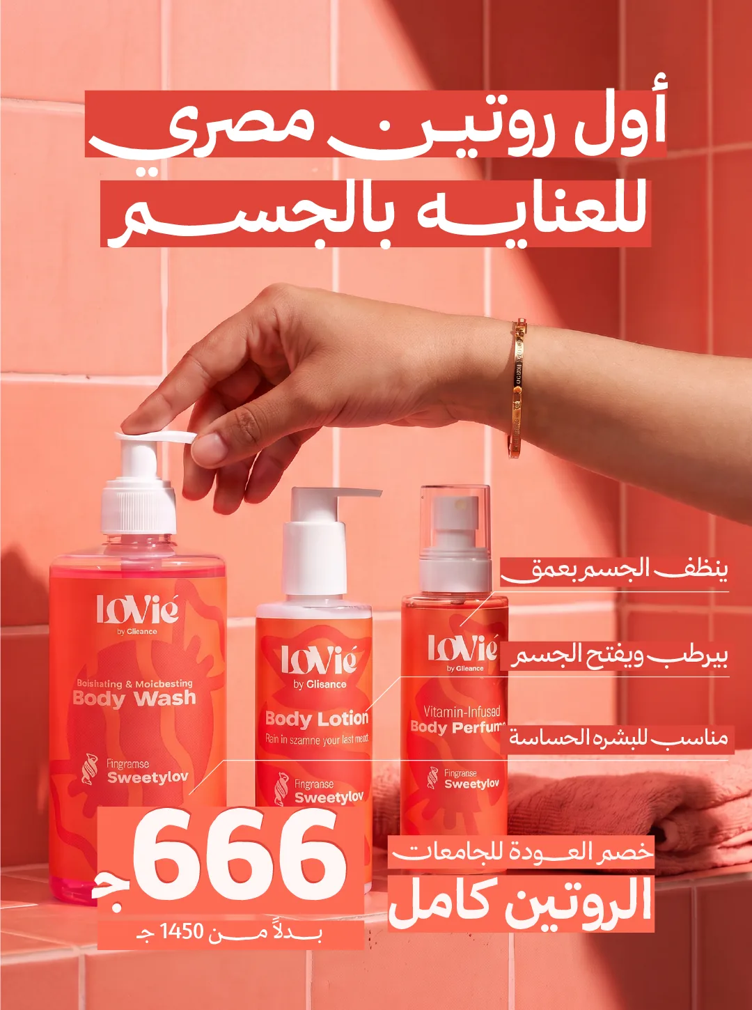
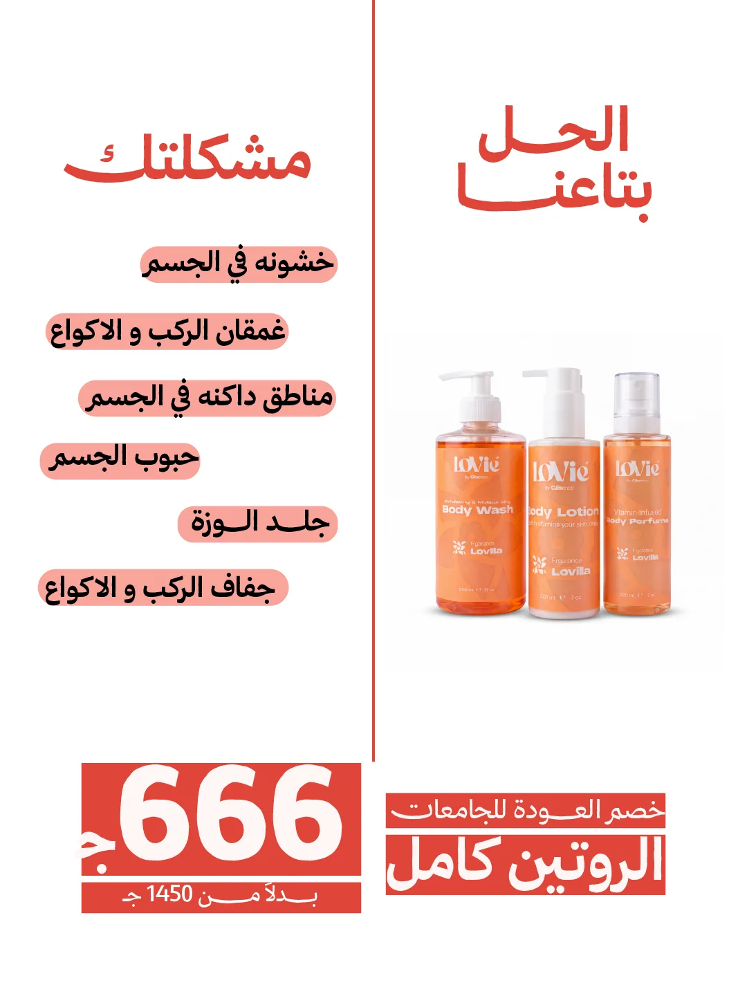
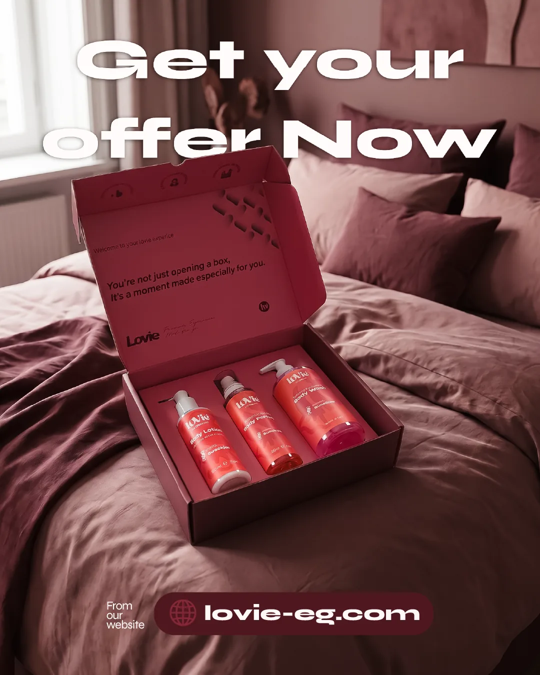
Three worlds, one template — the creative system at work.
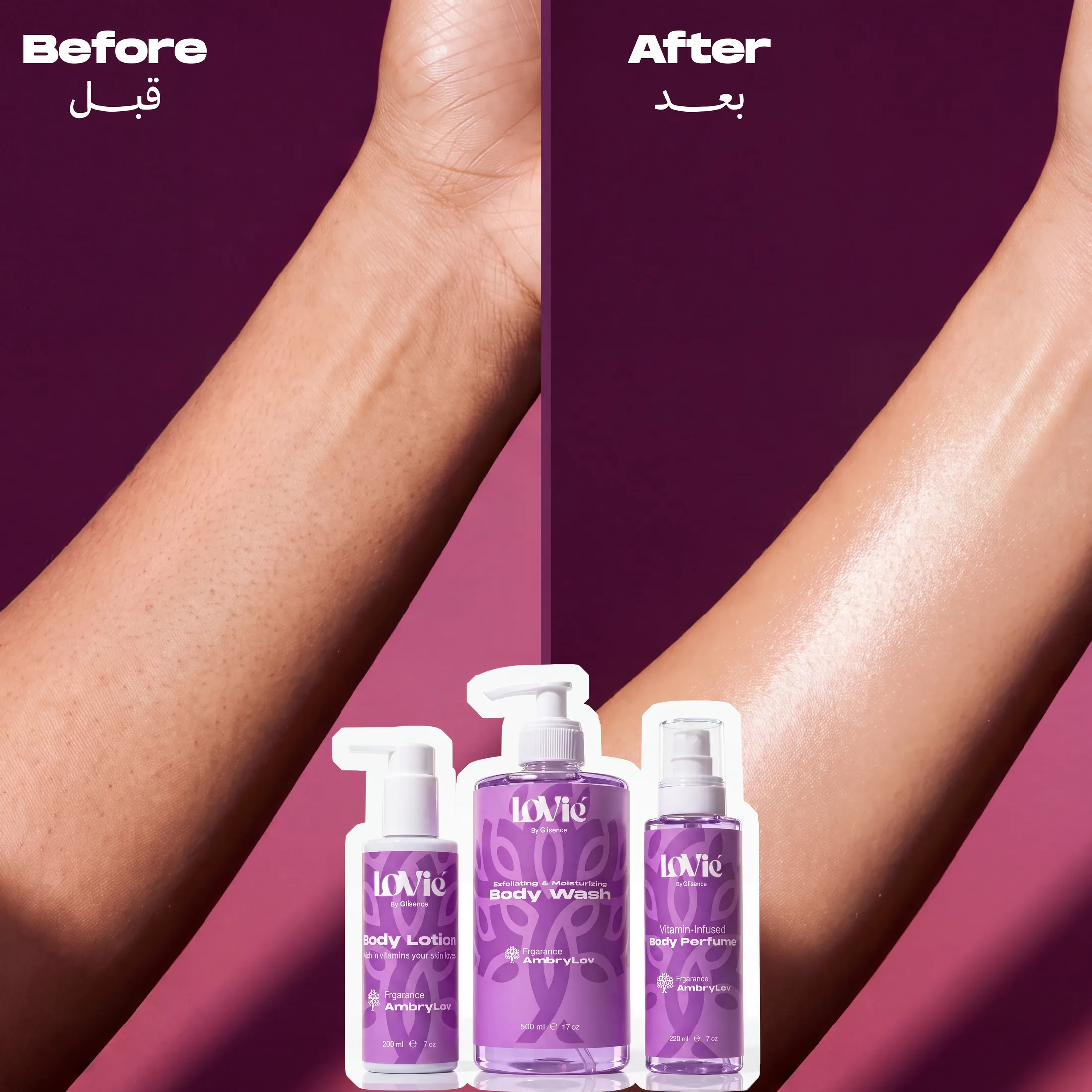
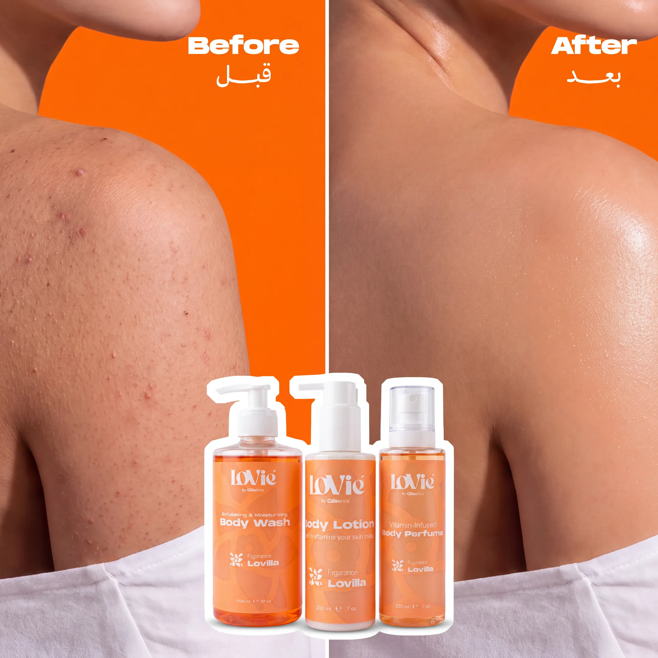
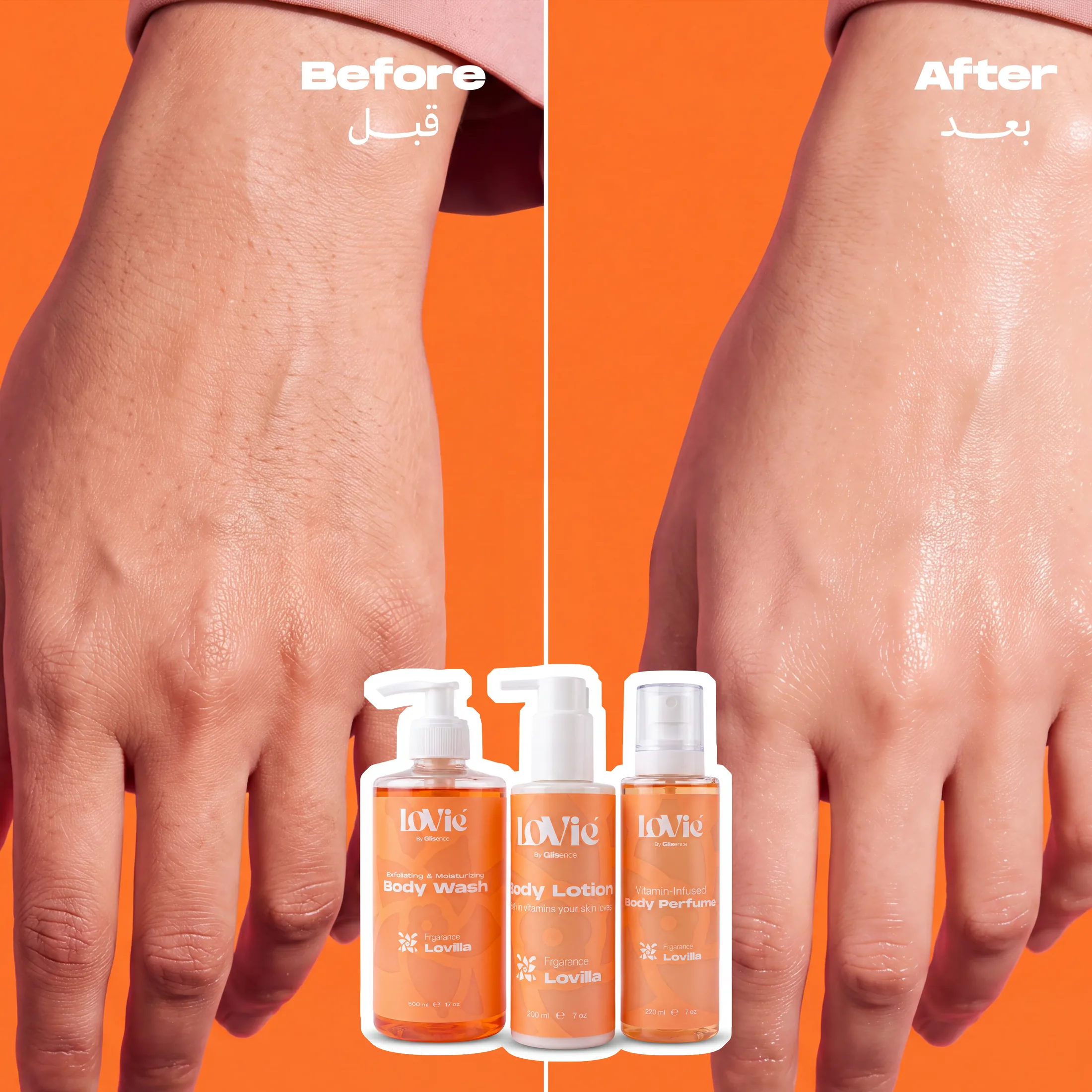
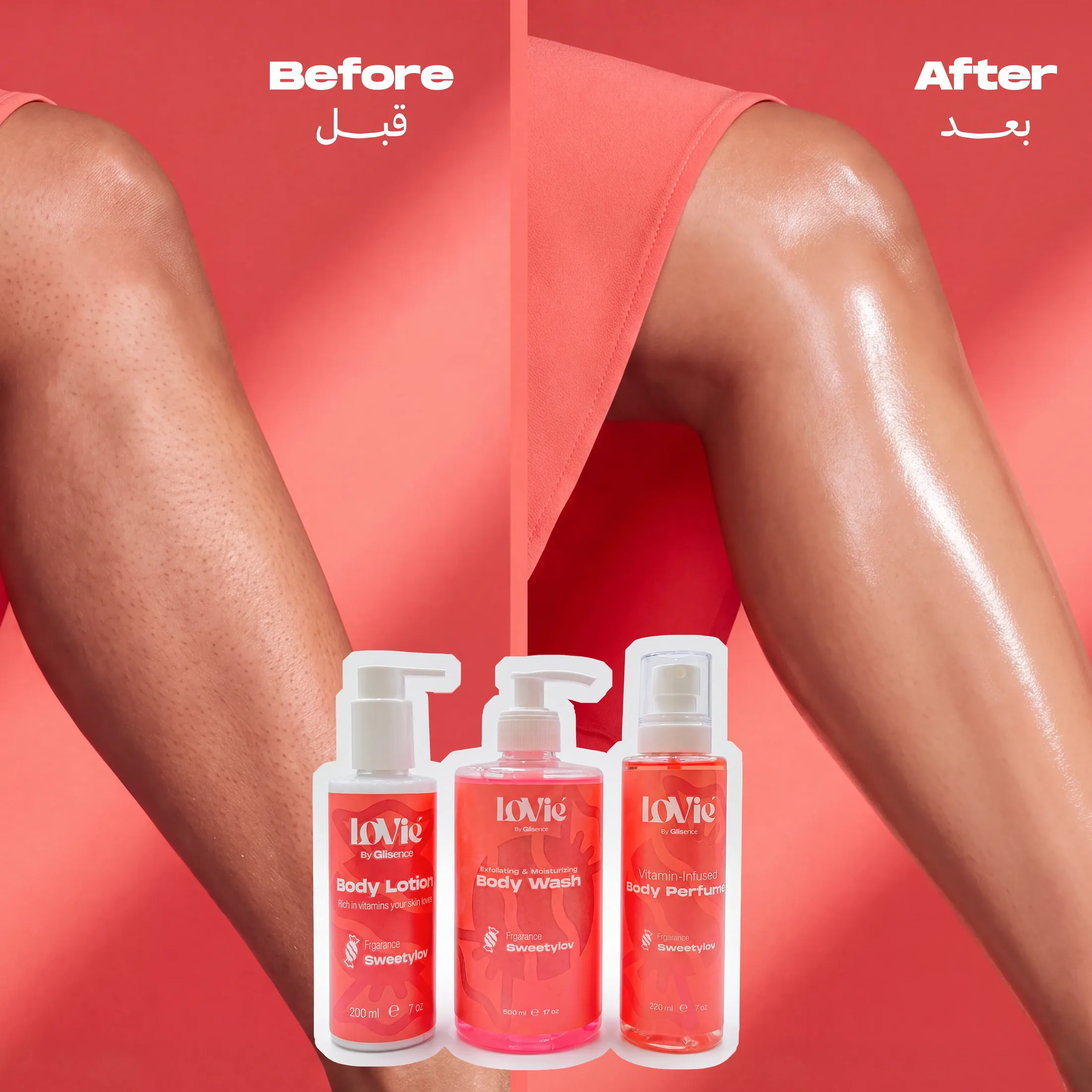
The claim, shown.
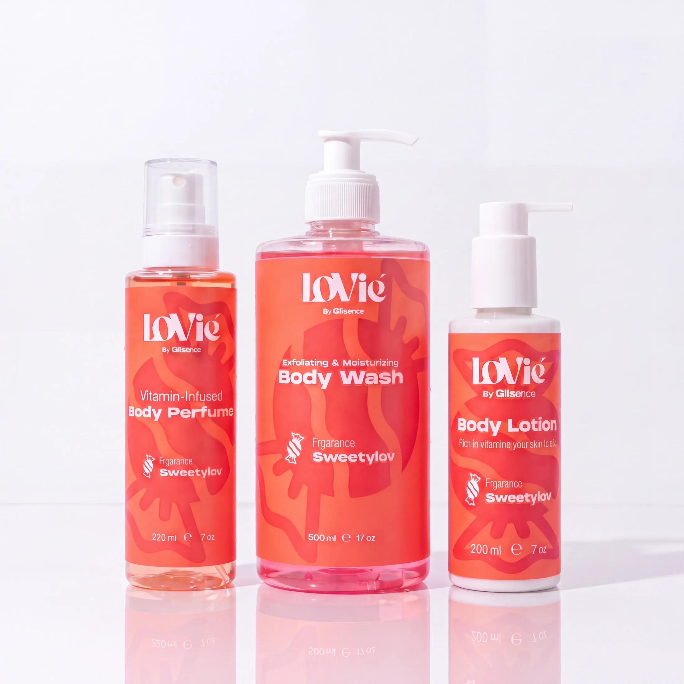
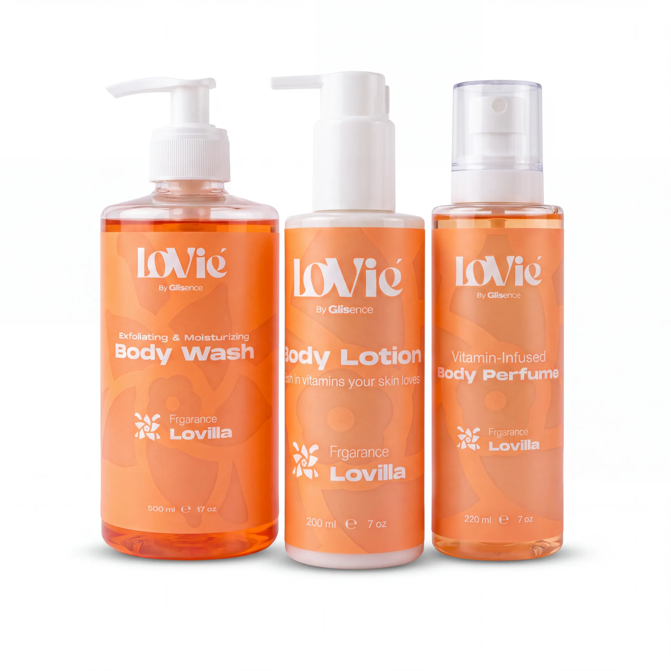
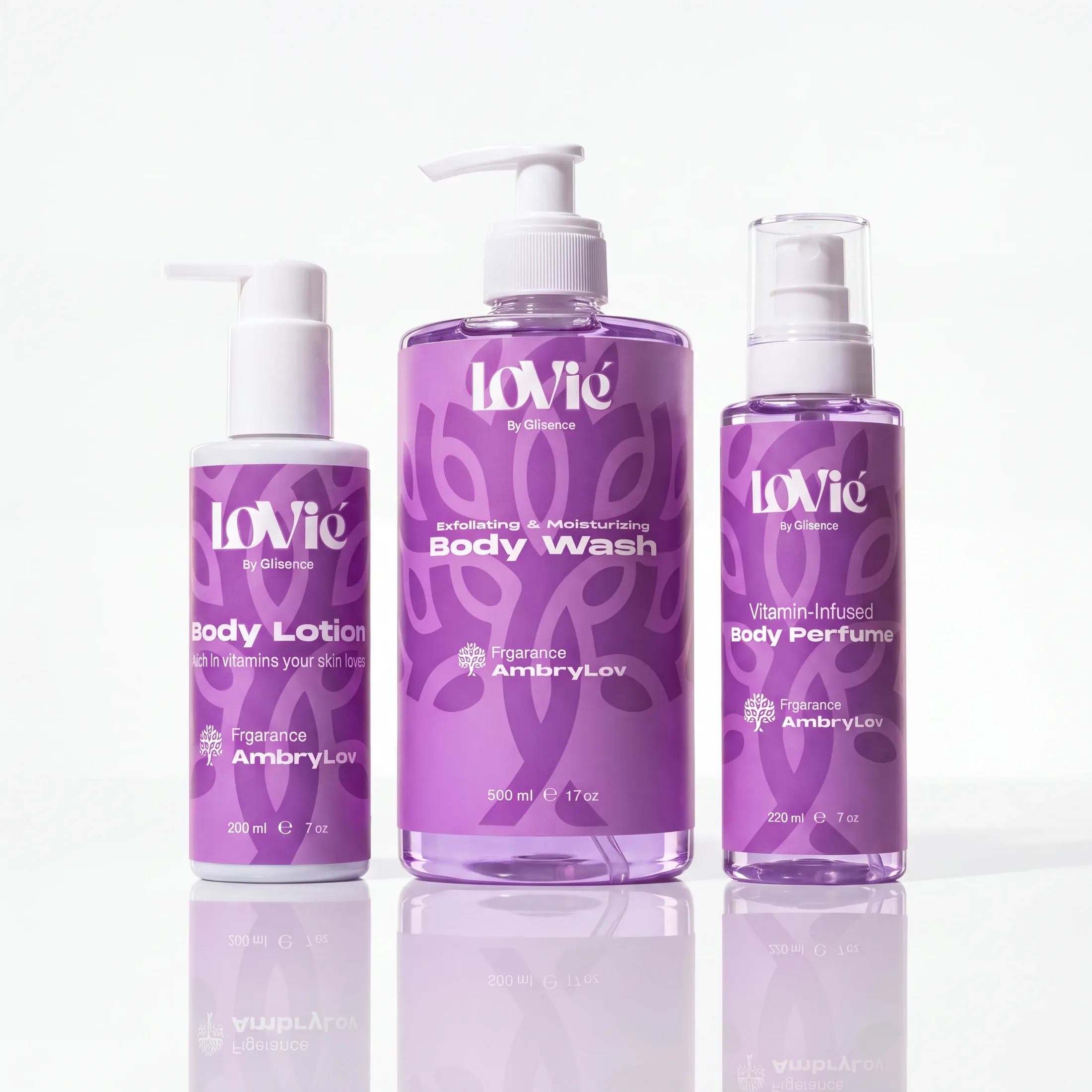
One construction, three colourways — from the same two frames.
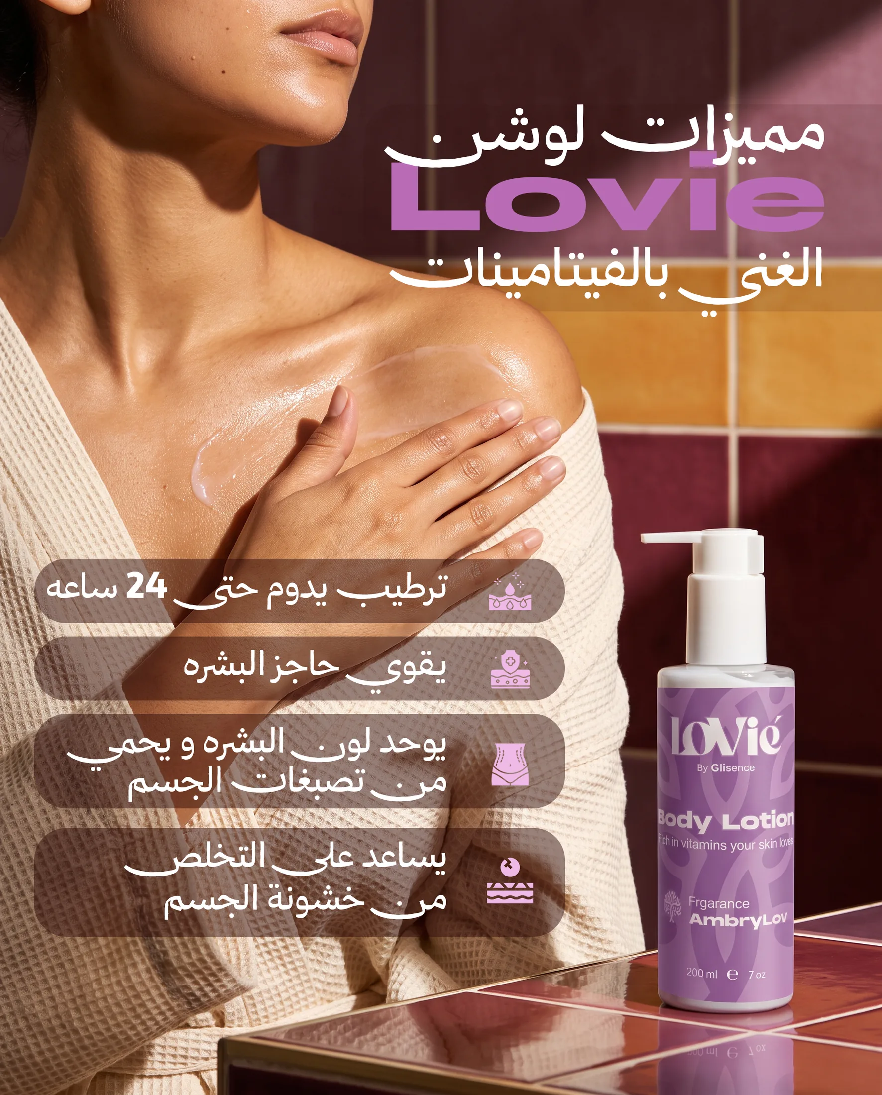
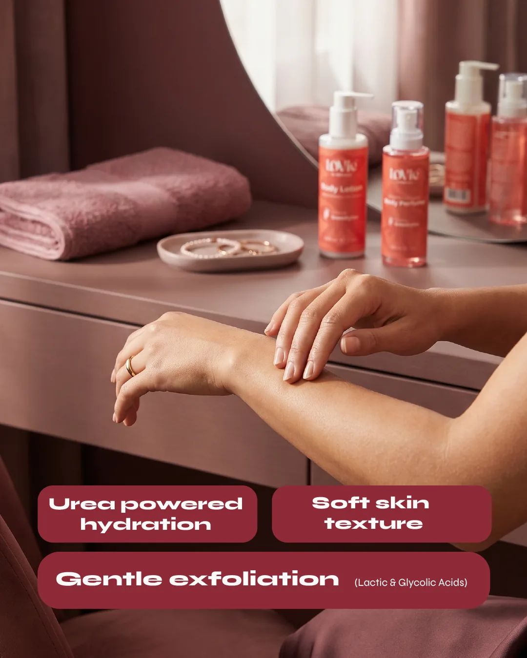
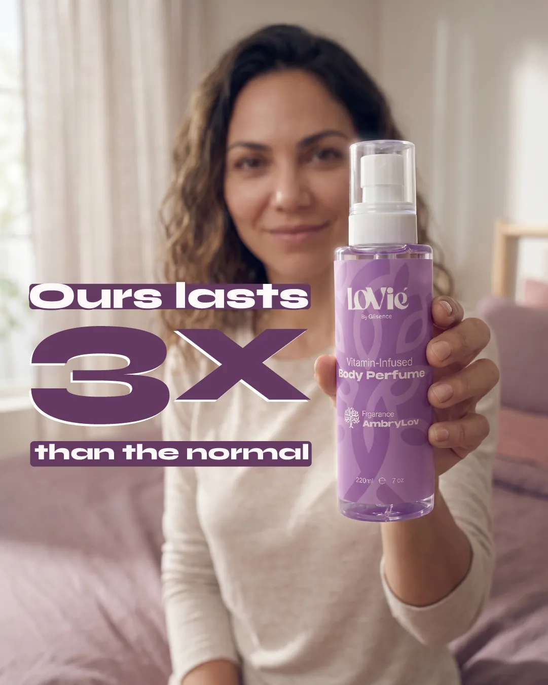
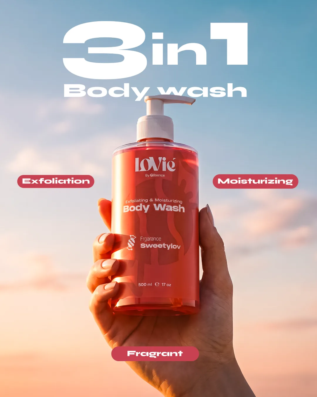
Each claim, its own frame.
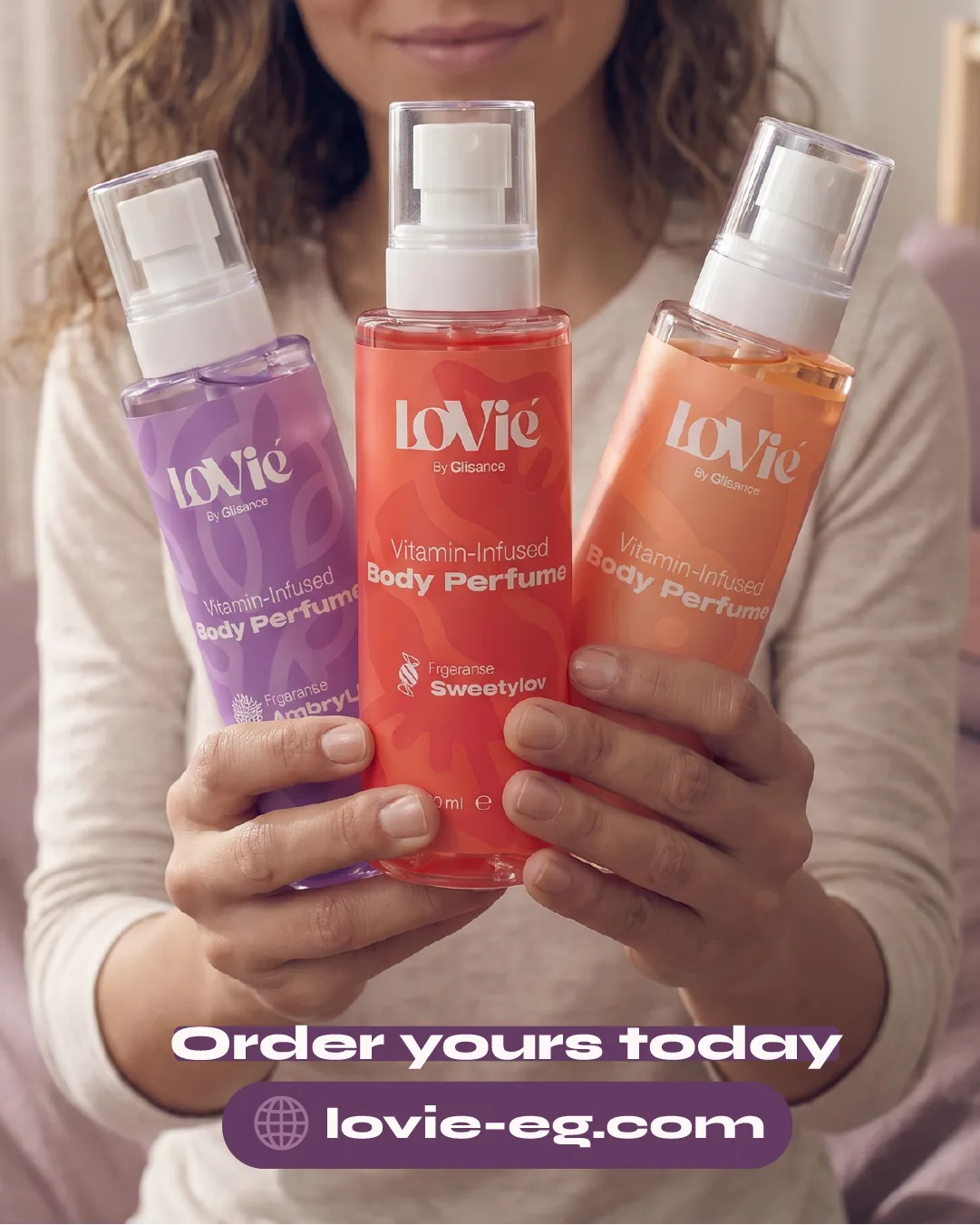
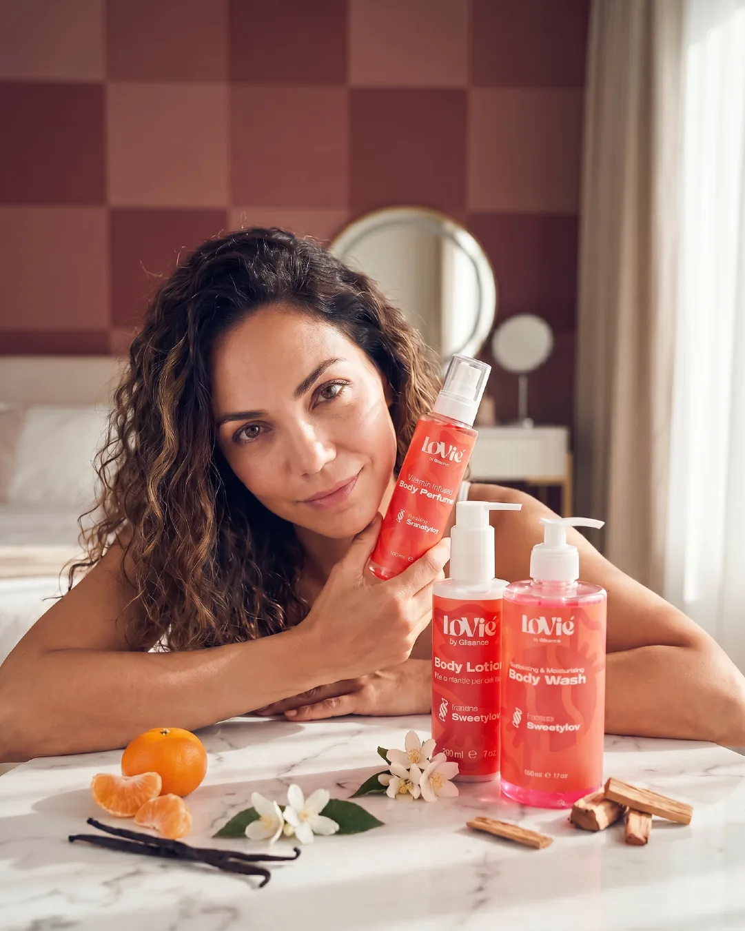
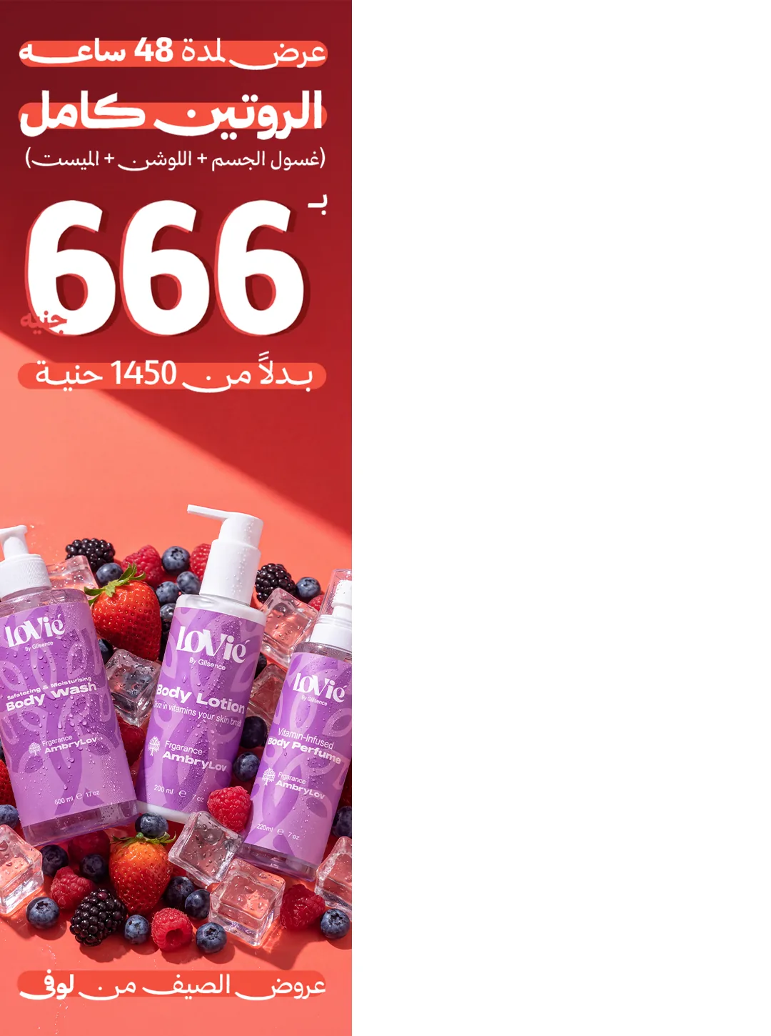
Order, ritual, season — the calendar, covered.
SAUDI ARABIA.
09 · The second market
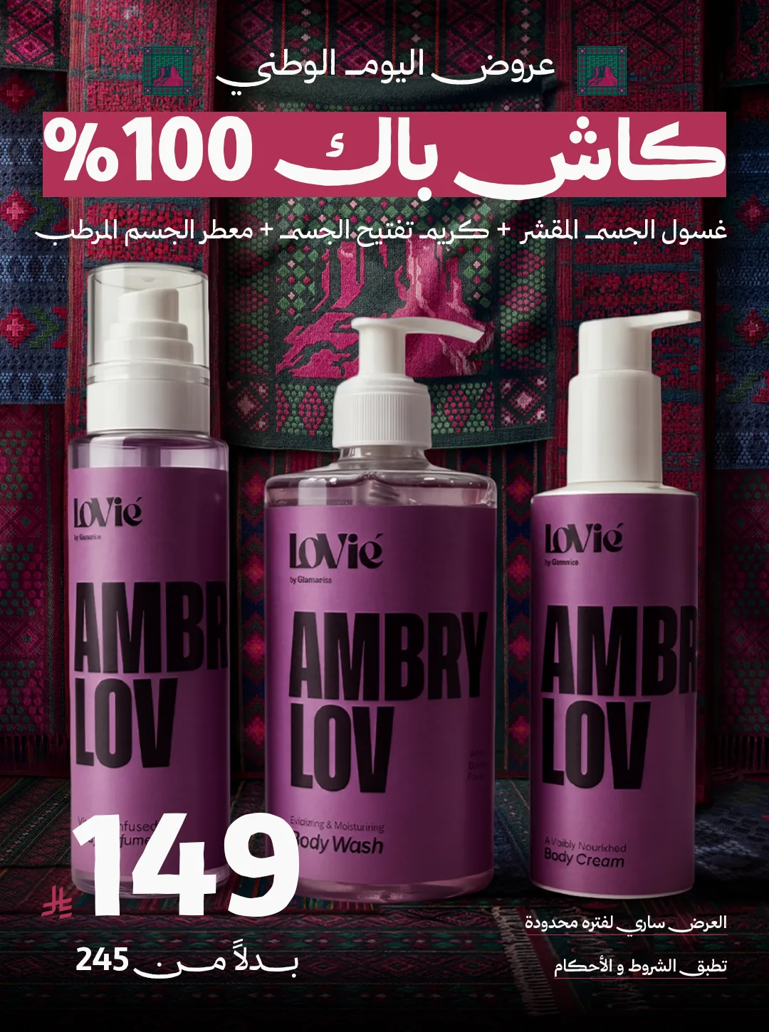
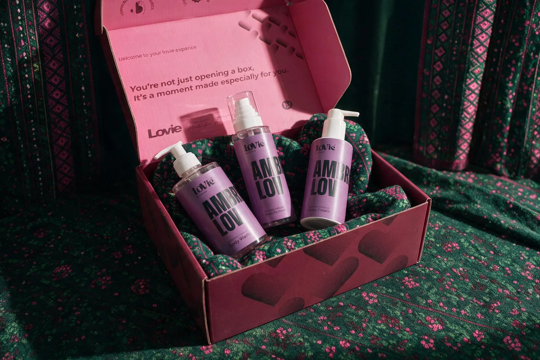
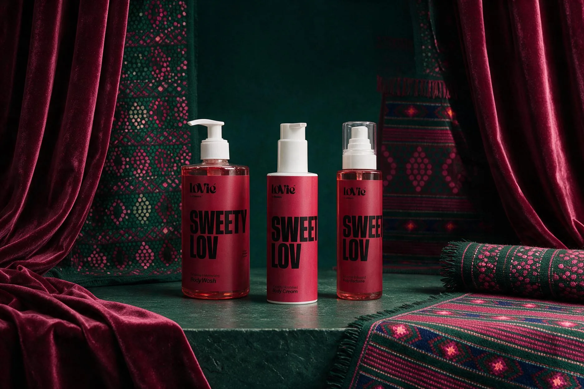
The brand crossed a border. LoVié keeps the architecture — three scent worlds, one register — and reshoots the world itself: sadu weave, velvet and brass, priced in riyals, campaigned on National Day.
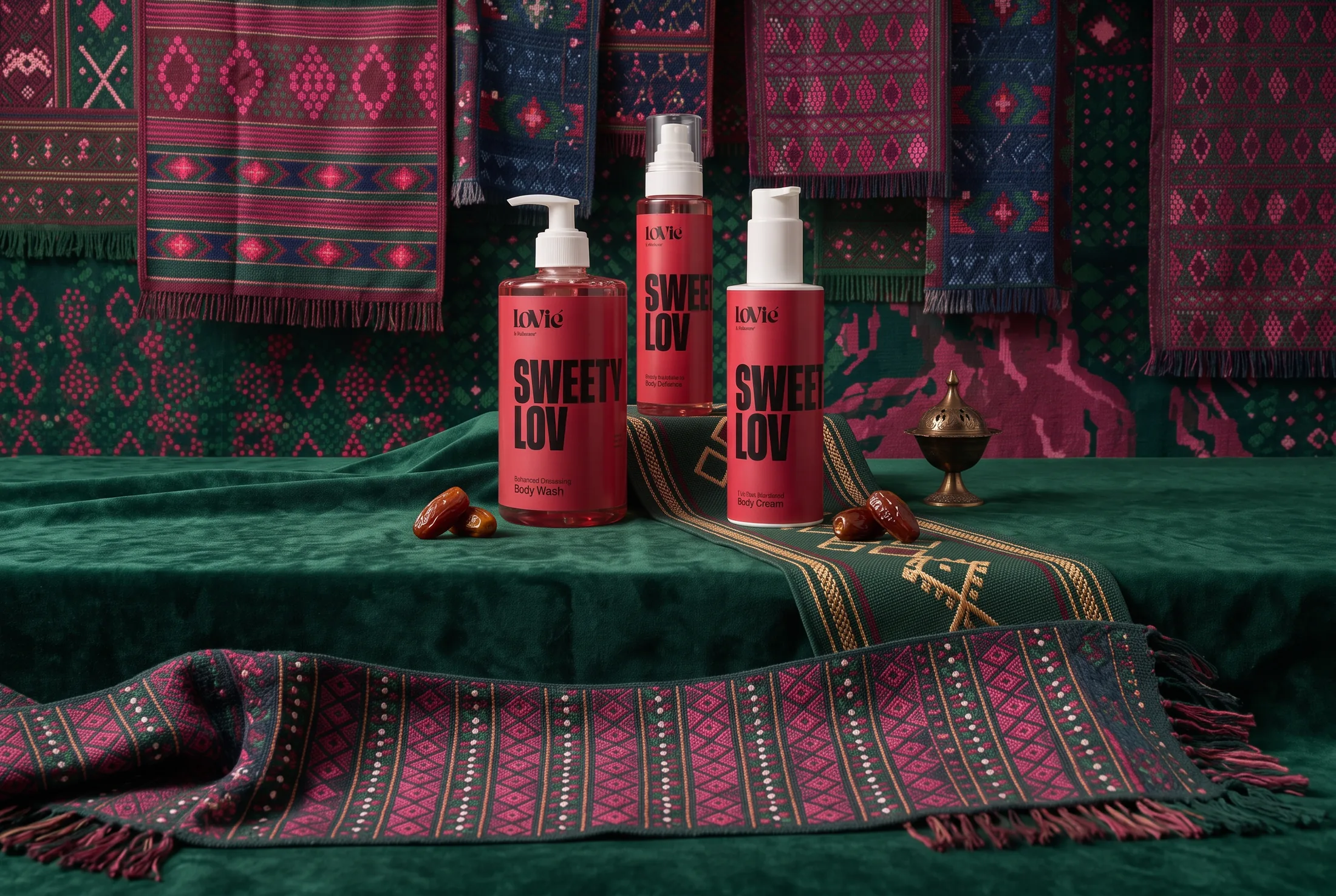
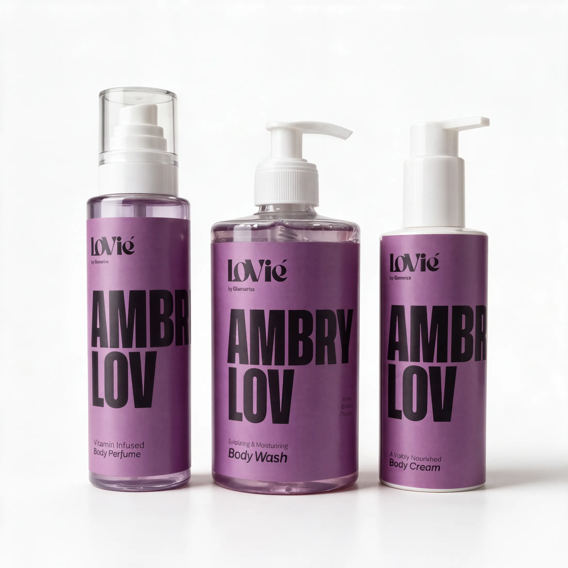
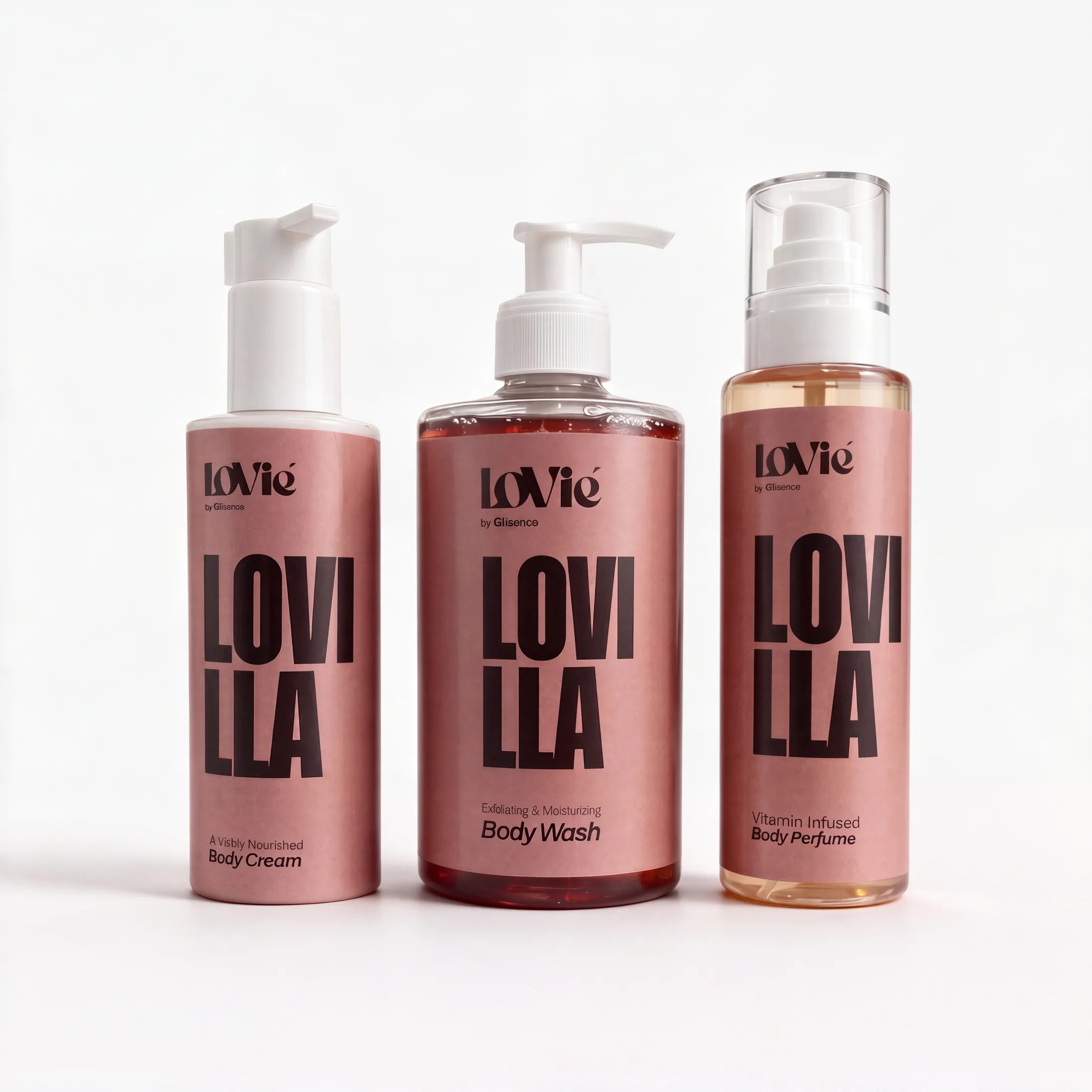
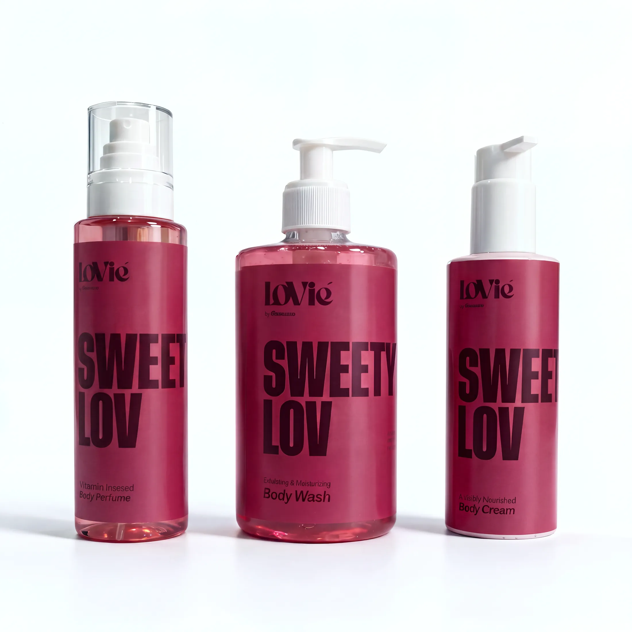
AmbryLov · Lovilla · SweetyLov — the same architecture, restated Arabic-first.
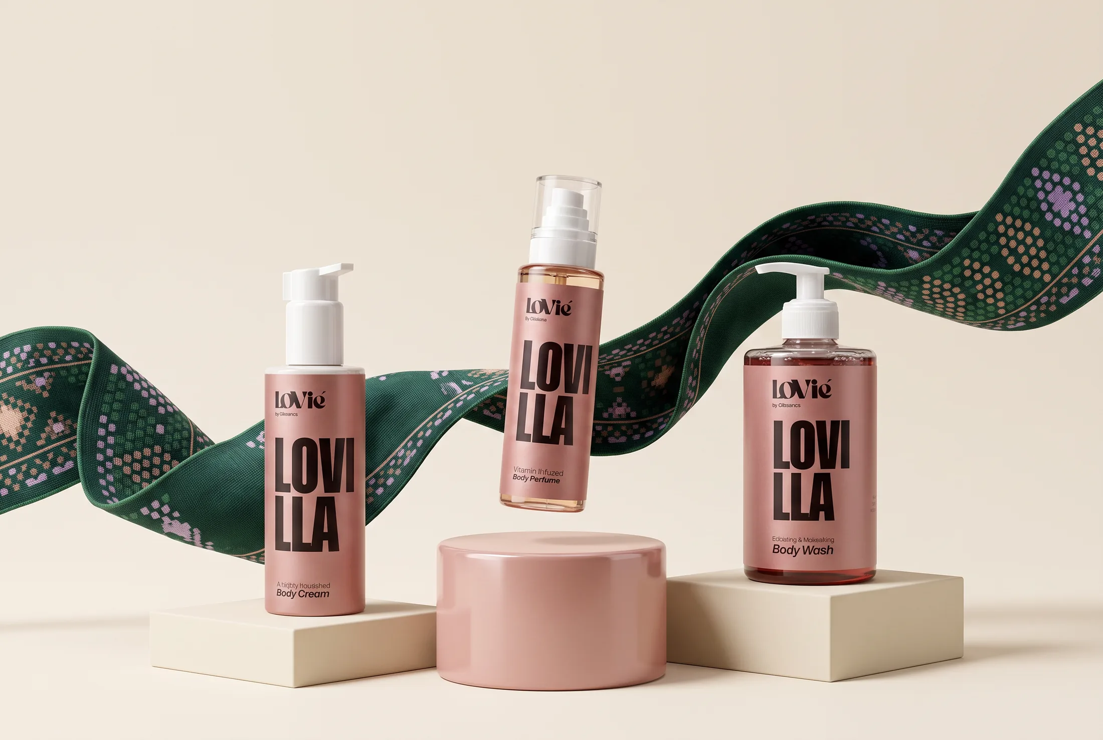
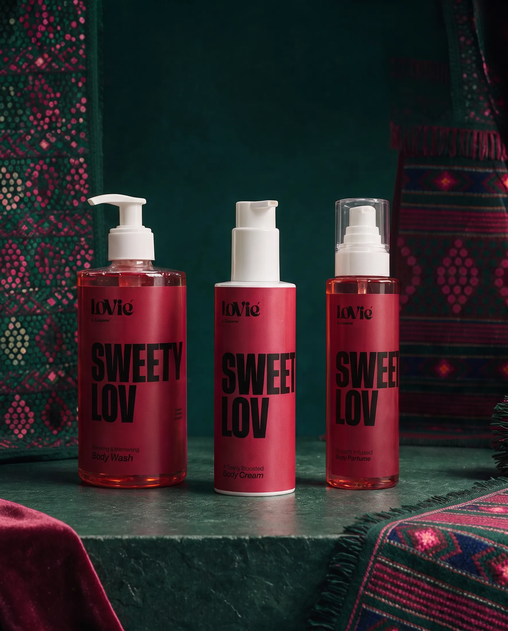
Designed end to end.By one designer.
[ Lovie is early — this ledger is what exists. Nothing invented. ]
[ The ledger — everything delivered ]
-
01
Identity
Wordmark, monogram, badge, three worlds — a 40-page rulebook.
-
02
Packaging
Bottles, labels, compliance decks, embossed tooling, the gift box.
-
03
Photography
A four-rule light language and the frames that obey it.
-
04
Ecommerce
Bilingual Shopify — pages built around the fold, bundles around the routine.
-
05
Creative system
Twelve formats, thirty-six variations, one template per world.
-
06
Documentation
Guidelines, creative bible, cheat sheet, campaign deck.
-
07
Launch assets
110 briefed ads — ready before spend.
-
08
Production
Print-ready artwork, mold drawings, pre-press.
-
09
Growth foundation
Offer ladder, angle matrix, media plan with kill rules — written before launch.
The science and the business are Dr. Samar’s. The design direction is mine: positioning, identity, packaging, imagery, store, growth creative — concept through production.